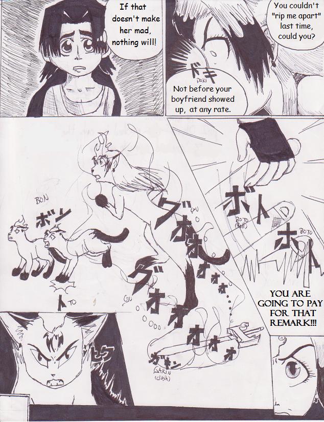
Midgar Meets Femol (Prologue page 3)
Midgar Meets Femol (Prologue page 3)
Midgar Meets Femol (Prologue page 3) by aeris7dragon

Description
Description
Yay the third page!!! Sorry about Sun's transformation; I wanted to see how it worked out, but it didn't turn out the way I visualized....It's still better than I could have done last year, right? (For those of you who didn't know how I drew last summer, compare this: http://www.fanart-central.net/pic-620173.html to this: http://www.fanart-central.net/pic-694151.html. Watch for the change in proportions.)
And thanks to naotarou-san, for the constructive criticism!! The second panel looks a lot better now!! Arigato!!!! ^^
Next page: http://www.fanart-central.net/pic-705765.html
Previous page: http://www.fanart-central.net/pic-704270.html
And thanks to naotarou-san, for the constructive criticism!! The second panel looks a lot better now!! Arigato!!!! ^^
Next page: http://www.fanart-central.net/pic-705765.html
Previous page: http://www.fanart-central.net/pic-704270.html
General Info
General Info
Ratings
Category Games » - by Publisher » Square-Enix » Final Fantasy series » Final Fantasy 7
Date Submitted
Views 1324
Favorites... 1
Vote Score 0
Category Games » - by Publisher » Square-Enix » Final Fantasy series » Final Fantasy 7
Date Submitted
Views 1324
Favorites... 1
Vote Score 0
Comments
5
Media Ink or markers
Time Taken
Reference
Media Ink or markers
Time Taken
Reference
Comments
You are not authorized to comment here. Your must be registered and logged in to comment
naotarou on August 1, 2008, 4:12:46 AM
naotarou on
aeris7dragon on August 6, 2008, 1:49:26 PM
aeris7dragon on
aeris7dragon on August 1, 2008, 2:05:35 PM
aeris7dragon on
luckylace222 on August 4, 2008, 5:05:26 AM
luckylace222 on
aeris7dragon on August 5, 2008, 6:11:00 AM
aeris7dragon on

I just think that the upper left panel would look a lot better if the shaded background was balanced. like maybe all the way to the edge or lines all the way across. :3
Don't get mad at me plz, o.O lol