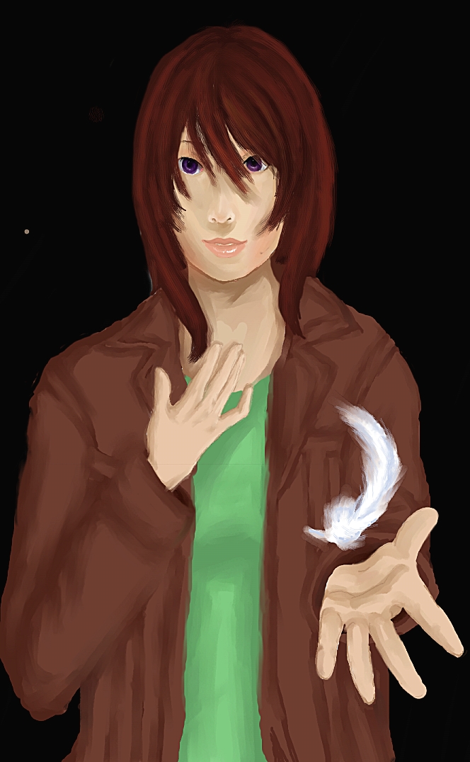
Risk -Unfinished- Improvement?
Risk -Unfinished- Improvement?
Risk -Unfinished- Improvement? by StonerPenguin

Description
Description
Unfinished picture is unfinished aaaannnd Gay concept is gay. (I plan on editing this over 9000!!)
So, you're probably wondering why I'd draw a lame-@$$ picture of a girl with a feather staring blaringly forward; Well, four years ago I got an account of FAC on the first picture I posted was a shootTY picture of a red-haired gay angel girl holding a feather, so I'm going off of that gay concept to see if I've improved :]
Here's the original; WARNING; BLINDLY BAD ART IS BLINDLY BAD. LAST CHANCE TO SAVE YOUR EYES. http://www.fanart-central.net/pic-154718.html (P.S. PLEASE DON'T LOOK AT MY -NESS. BBBBBBAAAAAAAAAAAAAAAAWWW D': I WAS SUCH A F-F-FAAAAAGGGG BAAAAAAAAAWW)
Buuuuuut, I'm getting apathetic with it (because it's not coming out as 'awesome' as I had hoped.) so I'm posting this unfinshed and update when I get around to it (Or maybe not, frack) ... Those are some poorly drawn hands D: GHDSBHFJSJKDCMSDKSMFCSNC FUUUUUUCCCCKKKK
General Info
General Info
Ratings
Category Anime/Manga » - Original art » Characters (Female)
Date Submitted
Views 1048
Favorites... 0
Vote Score 1
Category Anime/Manga » - Original art » Characters (Female)
Date Submitted
Views 1048
Favorites... 0
Vote Score 1
Comments
8
Media Digital drawing or painting
Time Taken I don't wanna think about it D:
Reference Not really
Media Digital drawing or painting
Time Taken I don't wanna think about it D:
Reference Not really
Comments
You are not authorized to comment here. Your must be registered and logged in to comment
ThomYorke on December 29, 2008, 3:44:55 PM
ThomYorke on
StonerPenguin on December 30, 2008, 1:12:10 AM
Blarg, I knew there was a shootpot of mistakes buuuut I figured only I would give a shoot and notice lol (And I said it wuz unfinished, yo)
Although I know the 'rule' for eyes (that pupils should be at the corner of the lips, eyes should be one 'eye' width apart, ect.) In your edit the eyes look too close together (But maybe that's because the lips are too narrow in my picture...)
And the lightsource(s) don't 'agree' with the entire picture because I began shading as I usually do (With a top light source) then remembered that I wanted the primary light source to be from the feather (light source from below). (And I was gonna add homo glowy 'snow' shoot like in the original picture so I lit the side of her hair to add that in later. Oh well.)
Sorry for the art doging, I found this piece to be particularly frustrating... However, I really appreciate that you'd take the time to help :O Thanks Benk =D
So do you take art classes? You should maek moar artz!!
As for references, I kinda tried to do iDNAR's (on dA) style, I ain't NEARLY as good as he is, but it's not bad for my first (sorta) realistic CG work, right? FUUUCCCCKK BAAAAAAAAAAAAAAAAAAAWWW http://idnar.deviantart.com/art/Kuchiki-Rukia-63711672
tl;dr ART dogING~! HOORAY!!
ThomYorke on December 30, 2008, 7:58:02 AM
ThomYorke on
ThomYorke on December 30, 2008, 7:58:32 AM
ThomYorke on
StonerPenguin on December 30, 2008, 8:55:16 AM
I just thought you took art classes because you know your shoot lol, I haven't taken any art classes either, all I got are two old-@$$ anatomy books from the 50's/60's lawl
Random question; Do you have another art account on another site os something? You seem to be pretty good with art stuff but you don't have much here so maybe it's elsewhere? I'd liek to see it :3
ThomYorke on December 30, 2008, 2:15:01 PM
ThomYorke on
StonerPenguin on January 3, 2009, 7:35:44 AM
ThomYorke on January 3, 2009, 11:35:31 AM
ThomYorke on

http://i235.photobucket.com/albums/ee289/PaDittSkift/ffffffffffff.png
well that's still there so it's too late now
Also, the shading IN the hair is really sporadic. Hair is hard to make look right.
Other than that, tremendous improvement!!!
Can I see a reference, mayhaps?