The A-TOM - PG 4
The A-TOM - PG 4
The A-TOM - PG 4 by Austadophilus

Description
Description
The A-TOM
Chapter One: The Psychic and The Sneak
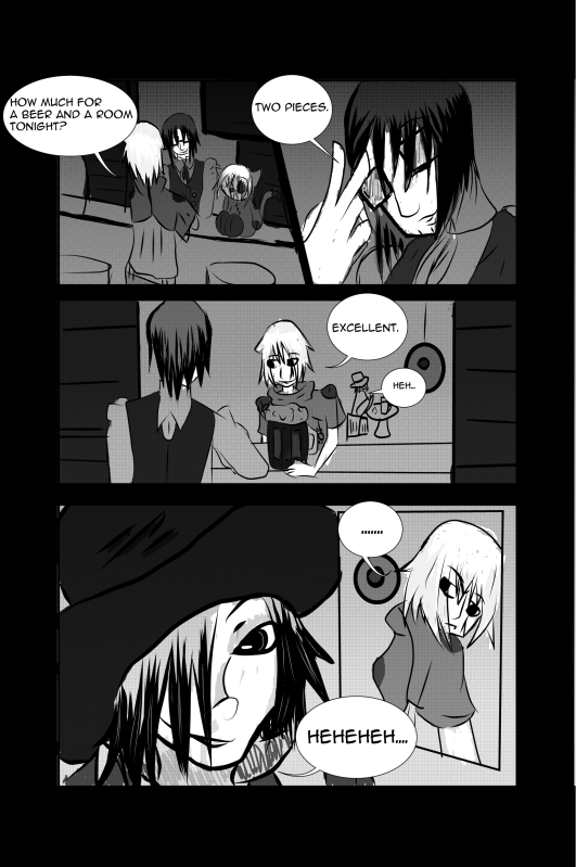
Page 4: An Onlooker
Zidga looks way too amused in the fourth panel. Well, i have been known to make stalker-like characters. ...I'm really messed up. God, this page only took forever since Manga Studio is such a damn fun chore to experiment with. But oh well. I'm a procrastinator as any. <3
The Bartender must have twitchy fingers. And I feel bad. i mean, i coulda worked harder to make sure Mr. Stitches was in every damn panel on this page. But what can one do?
And with the fifth page, I can join luckyLace's comic club! So excited. ^^
General Info
General Info
Ratings
Category Comics » - Original Comics » - Pages & panels
Date Submitted
Views 582
Favorites... 0
Vote Score 0
Category Comics » - Original Comics » - Pages & panels
Date Submitted
Views 582
Favorites... 0
Vote Score 0
Comments
4
Media Digital drawing or painting
Time Taken
Reference
Media Digital drawing or painting
Time Taken
Reference
Comments
You are not authorized to comment here. Your must be registered and logged in to comment
luckylace222 on June 4, 2012, 1:55:17 PM
luckylace222 on
Austadophilus on June 6, 2012, 10:27:23 AM
luckylace222 on June 4, 2012, 1:57:18 PM
luckylace222 on
I just need to figure out a way to keep comic member's CONTINUOUSLY interested in their own comics...
Rosendahl on June 1, 2012, 6:25:43 AM
Rosendahl on
Just to very careful with those eyes, the large size is awesome, I myself is a sucker for the slight surrealistic sized eyes, but I mean that one does not get too far down from the other, like in the last panel. What could perhaps be a cool pick, turns into a little awkward picture. The left eye, for an example, should just get a little more up and it would be nice. If the chance is of course, that the entire face is all the way around, perhaps lifting the face up a bit would be in order.
