Everything Means Nothing to Me
Everything Means Nothing to Me
Everything Means Nothing to Me by BAMFManiac

Description
Description
General Info
General Info
Comments
3
Media Unspecified
Time Taken
Reference
Media Unspecified
Time Taken
Reference
Comments
You are not authorized to comment here. Your must be registered and logged in to comment
Jyan on February 17, 2006, 11:07:08 AM
Jyan on
Jyan on February 17, 2006, 11:06:54 AM
Jyan on
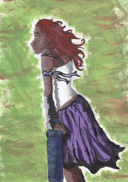
This is an awesome drawing! You sound so bored when you are talking about it, but I really like it and would be very proud if I drew it =)
The colors are great, what did you use? It's really hard to do shading without a reference, but this is cool =) I like the shading on the back and for the arm the best. You did an aura like in your Turnaround picture, but I like how you did it with color (or lack there of), it makes it more... subtle I guess is the word, but that helps the pic be powerful (drawing is largely about the details you don't cognitively pick up at first glance).
Her pose is cool, you did the shapes perfectly =) You even stepped out of your habit of drawing tall and thin very well. Perfectly proportional! I'm not saying that habits, or styles, are bad, it's just it's VERY hard to stop doing them for a picture. It is a very impressive skill to be able to "step" into and out of your styles whenever you want. I'm impressed =D

I like the fact that the pose is so simple (not to draw, but as a pose). It allowed you to express yourself through the other, more subtle ways: In the expression in her eyes, the wind through her hair and skirt, blend of colors, your creative outfits, shading, positioning... everything. There is only so much space on any piece of paper and you used every piece of this one to creatively express your feeling for this picture, however simple it may seem. That is cool =)
I am very jealous of this picture, It HAS to go into my faves ;)
I'll try to post again later =) Keep up the good work!