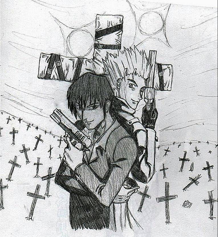
Vash and Wolfwood: A Team of Two
Vash and Wolfwood: A Team of Two
Vash and Wolfwood: A Team of Two by BAMFManiac

Description
Description
General Info
General Info
Comments
23
Media Unspecified
Time Taken
Reference
Media Unspecified
Time Taken
Reference
Comments
You are not authorized to comment here. Your must be registered and logged in to comment
BeastMaster_Girl on April 1, 2006, 1:36:08 AM
Midvalley_and_Dominique on October 12, 2005, 7:55:04 AM
shandouski on January 6, 2005, 7:20:40 AM
shandouski on
JinLover on August 6, 2004, 12:01:02 PM
JinLover on
King_Trigun on June 19, 2004, 1:57:27 AM
King_Trigun on
Riku_gurl on June 14, 2004, 8:41:39 AM
Riku_gurl on
Kit_wit_issues on May 14, 2004, 4:24:24 PM
Kit_wit_issues on May 14, 2004, 4:23:55 PM
BAMFManiac on April 28, 2004, 12:14:16 PM
BAMFManiac on
<br />
but thank you, and just so you know, i didn't mean this as a yaoi pic (not really into that). i used a reference, so i'm not sure if the original was supposed to hint at yaoi, but i doubt it. they're just being cool and getting ready to kick @$$! hurray!
vash_and_wolfwood on April 26, 2004, 12:27:31 PM
DeathBo on April 11, 2004, 5:24:34 PM
DeathBo on
Jyan on February 24, 2004, 7:27:55 PM
Jyan on
WaterNeko_Goddess on February 23, 2004, 8:59:03 AM
Angie-chan on February 14, 2004, 5:21:06 PM
Angie-chan on
Jyan on February 2, 2004, 12:29:29 PM
Jyan on
http://fanart.ctgameinfo.com/pictures.php?op=picture&picture=38548
BAMFManiac on February 1, 2004, 2:06:37 PM
BAMFManiac on
<br />
haha yes the shading is much cooler that way- screw accuracy!! o and yea my scanner used to do an auto-align thing which would mess up all my pics, but i shut that off so everything scnas correctly now. i do have a rotator, but it only rotates by certain degrees- no free rotate. (i'm not very good w/ graphics programs anyway)<br />
<br />
yea backgrounds and I have never really gotten along. then again i haven't "grown up" yet (hopefully i never will!) so perhaps it'll just take some time for me to get used to the idea. <br />
<br />
no i've taken very few art classes, which were at my skool, and i've never really been taught anything of use for my own art. (we mostly drew still lifes or did blind contour drawings and quick sketches from the model). i really want to take some sort of course to teach me how to draw backgrounds tho- maybe next year. wow if you'd really draw a tutorial thing that'd be great!!! thanks so much!
Jyan on February 1, 2004, 8:21:48 AM
Jyan on
<br />
What I think might help you is if you concentrated on the details of it instead of the whole thing at once. That way it isn't exactly like a background, it is more like a bunch of smaller foreground pic (if that makes sense =)).<br />
<br />
Have you ever been taught about perspectives and vanishing points? Those are especially useful for drawing outdoor drawings. If you haven't been taught about them I'll draw a quick thing about them (Prolly a city street with buildings) and show you the different parts.<br />
Jyan on February 1, 2004, 8:21:37 AM
Jyan on
Jyan on February 1, 2004, 8:21:29 AM
Jyan on
<br />
It was rotated when you scanned it? Hm... I've gotten two scanners before and they each came with a program to modify the pictures they scan. Are you sure you can't re-rotate it with that? If you can't then I can do it for you (Well, I already did it to see how you intended the pic to look, so I can give it to you ;)).<br />
<br />
Well personally I think it looks nicer now than it would be if it had dark shading all over their fronts. That would disallow the advantage of shading (Because it would pretty much all be just solid). So the original artist drew it with some shadows in front of them because that is cooler, and both suns behind them because THAT was cooler, they just either forgot or thought it was worth it (Prolly the latter) that it wasn't correct. Which, actually even though I am a perfectionist, might even agree on ;)<br />
<br />
Yea! It would be cool if you drew more backgrounds =) I can see why you can be a little nervous about drawing them (I was too when I was young, but then I guess when I grew up and stopped drawing for a while I kinda forgot to be afraid ;) But then again... I haven't drawn many backgrounds lately. Hm... could I still be afraid? Lol) but honestly I think you would do great with them.<br />
<br />
What I think might help you is if you concentrated on the details of it instead of the whole thing at once. That way it isn't exactly like a background, it is more like a bunch of smaller foreground pic (if that makes sense =)).
BAMFManiac on January 31, 2004, 3:54:44 PM
BAMFManiac on
<br />
heh yea i got kind of lazy when i did the backgound, so that's why the crosses are all scribbly. eck and vash's hair came out so bad, i know. but shading it more might help...<br />
<br />
i'm not sure about the shadowing thing- you're rite, that's how the original artist shaded it, also. o and this pic scanned at an angle (i have an icky scanner), so that's why there's that white spot in the corner. i did crop it, but by mistake i uploaded the uncropped pic. <br />
<br />
o and thanks! lol i should start doing backgrounds more if they're really that effective
Jyan on January 31, 2004, 8:50:43 AM
Jyan on
I like the repetition of shape (cross) and the fact that they are all at different angles on an un-even slope, which gives it a certain mood. Is the picture drawn at a slant or was it just folded over or something in the top right hand corner? You could just crop that top section off if you wanted to. Vash's hair looks cool, but I just realized it looked a little flat. You might want to put a little bit of shading at the base of it where it meets the head. Technically Wolfwood's hair has the same problem, but it isn't apparent because it is so dark and there isn't as much of a difference in the shading. You drew the longer strands darker so that helps too.<br />
<br />
It is pretty obvious that the light source(s) are behind them, but the shadows don't accurately portray that really. It looks like it is a flaw the original artist did as well, probably because he wanted to add both the suns in there and he didn't want to draw the two characters completely dark. I supposed there could be a third light source in front of Wolfwood and to his left that would make those lights, but normally if there is a sun (and especially if there is two!) then it(they) is (are) the dominant light source. But non-the-less the shading looks cool =)<br />
<br />
I'd say this is my favorite drawing of yours =) It would just be an average drawing for you (Which is still high quality =)) if it wasn't for the background (even though the foreground is drawn a lot better and I like it better). I know you hate doing those but they really are effective ;)
Nami on January 29, 2004, 8:11:31 AM
Nami on
