Username   Password  
Remember   Register   |   Forgot your password?

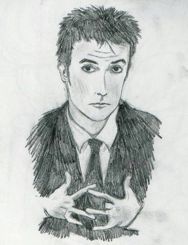
John Cusack

John Cusack

John Cusack by BAMFManiac

Description

Description
BAMFManiac
resubmitting some more. um this was another attempt at realism. i really screwd the hands, but i redid them so many times that i just didn't feel like fixing them anymore. <br />
<br />
Comments are greatly appreciated!!

General Info

General Info
Ratings
None

Category Real People » Actors/Actresses
Date Submitted
Views 1778
Favorites... 0
Vote Score 0
Comments 9
Media Unspecified
Time Taken
Reference
Tags

Comments

Comments (9)

You are not authorized to comment here. Your must be registered and logged in to comment

DeathBo on April 11, 2004, 5:26:35 PM

DeathBo on
DeathBogood job

Jyan on April 7, 2004, 7:43:23 PM

Jyan on
JyanIts ok, it took me two weeks to do 20 minutes of work on that one pic =D

BAMFManiac on April 7, 2004, 4:59:43 PM

BAMFManiac on
BAMFManiacoo woot suction cups! <br />
<br />
yea you can all see the finished work... if and when i get the energy to dig up that drawing pad and scan it... heh sorry, lazy i am

Jyan on April 6, 2004, 1:32:44 PM

Jyan on
JyanI want alien hands! Ooo, with suction cups at the ends of my fingers! =D Ahem, well anyways, do we get to see the finished work ? =D

BAMFManiac on February 1, 2004, 11:12:30 AM

BAMFManiac on
BAMFManiachaha yea that's exactly why i did it- every person who saw this drawing was like "dude! what's up with his hands?!?!?!" (ok they weren't that excited, but you get the picture). so i figured that if they were able to see the tie clearly, maybe they'd get off my back about his "alien hands."

Jyan on February 1, 2004, 9:03:04 AM

Jyan on
JyanCool =) I didn't think about drawing the tie darker. I knew there was a lack of contrast that made that area a little hard to see, but it didn't really register. That seems actually like a significant act because if they can see more easily how he is manipulating it with his fingers then it might be more apparent on why his fingers are like that.

BAMFManiac on January 31, 2004, 3:34:47 PM

BAMFManiac on
BAMFManiachaha yea the hands... i've heard many comments about them from my friends and other viewers of this pic. it's tru that in the pic i used as a reference, the fingers were at an exaggerated angle, but one of the problems is that it's a black and white photo, so the shading was hard to see. but i agree, i definitely should have used more shading. <br />
<br />
lol yea his fingers are also too skinny- at first i made them too fat and then i kept redoing them (heh i did those hands about 7 times)... and after a while i sort of lost patience/was too tired to fix them. <br />
<br />
i have fixed up this drawing a bit since i've scanned it- made the tie darker and also darkened some of the shadows, so it might look a little better now.

Jyan on January 31, 2004, 9:24:07 AM

Jyan on
JyanWith his left hand (our right)it looks better. I think the main thing wrong with it is the pinky is too far away from his ring finger. It might have been going away from the hand, but at the base of the pinky it wouldn't be that far away from the base of his ring finger. And if it was going off at a different direction like that it would be at a different angle than the ring finger.<br />
<br />
Also, shading helps define when the fingers bend and such. I saw this other picture like two days ago from Fanart and the only thing I can remember about it was its really cool hand that wasn't even the focus of the picture ;) It was just the fact that it had such exaggerated shading on it that you could perfectly tell how the fingers were bending. Now of course that was a cartoon and you can do that, whereas if you exaggerated the shadows on a realistic pic you would either make it look funny or have to draw the entire thing like that.

Jyan on January 31, 2004, 9:23:54 AM

Jyan on
JyanThe face is real cool, and I like the cloths (Mainly because they are dark and I hate drawing dark so I appreciate it greatly ;)) The hair is cool and the proportions are good. The hands are off though =P It is extremely difficult to draw hands correctly, and then when you draw them in different positions than you are used to it gets even worse. I would recommend for you to, first, draw the hand with all the fingers showing and fully visible (even the middle fingers) so that way you can get a feeling for it better. Obviously you don't have to put great detail into the middle fingers because you are just going to draw right over them again, but they are a good guideline. The thumbs look relatively fine, but the other fingers look thinner than normal. I would say the biggest problem with his right hand (our left) is that his pinky is at an awkward angle, it pretty severe and it is kinda long for having a bend like that. I know that is probably how it was in the pic you copied from, but sometimes you draw other aspects of the picture not exactly the same as in the original so when you draw something else (like a pinky) it doesn't look right. So in cases like that it is ok to draw the "something else" (Pinky) differently (at a less severe angle). Probably why it was like that was because of a wrinkle in the cloths it was resting on or something. The body of the right hand also seems a little short and thin.