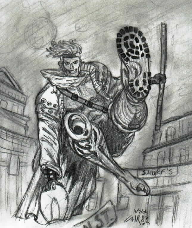
Cajun Leap
Cajun Leap
Cajun Leap by BAMFManiac

Description
Description
mmm yea i started this ages ago and finally finished it. yay! i used a reference i found online. didn't come out as good as i'd hoped. the background is eh and i don't like his face. but god that angle was hard! the foot thing? yea that took me a while. <br />
<br />
so um yea that's it, i guess. hope you like it and please leave a comment
<br />
so um yea that's it, i guess. hope you like it and please leave a comment
General Info
General Info
Ratings
Category Comics » - Marvel Comics » X-Men
Date Submitted
Views 2744
Favorites... 1
Vote Score 0
Category Comics » - Marvel Comics » X-Men
Date Submitted
Views 2744
Favorites... 1
Vote Score 0
Comments
15
Media Unspecified
Time Taken
Reference
Media Unspecified
Time Taken
Reference
Comments
You are not authorized to comment here. Your must be registered and logged in to comment
scarlet_witch on June 30, 2005, 5:24:29 PM
DreamOfFire on May 7, 2004, 2:55:14 PM
DreamOfFire on
BAMFManiac on April 15, 2004, 2:11:03 PM
BAMFManiac on
<br />
yes! smurfs rule! the original pic had some unintellible sign so i just put smurf's instead...<br />
<br />
o thanks caz-chan! lol i'm not too good at perspective either, which is why i had to use a reference fot this one. but yea i can't wait to see yours!
Baby-Bunny on April 13, 2004, 7:09:59 AM
Baby-Bunny on
yayyyy Gambit gambit gambit!!! =^______^= your such a good artist! *admires your skills jealously* i suck at persective and stuff like that --_--; i think your shading is good and i just luv your skechy style! i like the way his hair is flowing aswell ^_^ well... Id better finnish off my gambit piccy 2... ==_==; COOL pic!! ^^
DeathBo on April 11, 2004, 5:45:52 PM
DeathBo on
Jyan on April 8, 2004, 9:46:12 PM
Jyan on
BAMFManiac on April 8, 2004, 2:52:26 PM
BAMFManiac on
<br />
*ducks* woo that was close. haha whoever's standing behind me is going to have gambit's boot mark on their face. pssh sucks for them<br />
<br />
and thanks very much, hearsegurl!
BAMFManiac on April 8, 2004, 2:49:36 PM
BAMFManiac on
<br />
and yes freaky face! he didn't look that scary in the original pic, tho. eh backgrounds... i spent so much time on actually drawing him that i barely had any patience left for the background. if i could colour, i would have, because it's hard to sketch clouds and stars and stuff. hehe and i like the blurry backgrounds very much, which is what i tried to do in this pic... rather unsuccessfully. i wanted the whole thing completely blurred but my smudgeness didn't come out too well. hehe my hands were covered in graphite
Hearsegurl on April 7, 2004, 7:33:56 PM
Hearsegurl on
Jyan on April 7, 2004, 6:49:45 PM
Jyan on
<br />
The background isn't bad. The less detail you put in the background the less it will take the focus. Have you ever noticed how sometimes people actually blur their backgrounds? I know Mac Hall does it religiously and a few other online comics. I’m not saying “Detail bad!” I’m just saying that it isn’t terrible to not have it. After all, most of the time you aren’t showing off your backgrounds, you are showing off your foreground. Backgrounds are mainly just a tool to set the mood and to make it so the focus is not just floating in space. As long as there is enough in the background to make the viewer get a sense of actually space and volume in the pic then the background has served it’s purpose, if it emphasizes a feeling then it has been fully utilized.<br />
<br />
Nice detail on Gambit though =) Great shading and manipulation of all the forms. He has funky cloths ;) The hair looks very windy, but somehow it looks flat. Maybe it is from lack of shading?<br />
<br />
Hm… Someone is going to have Gambit’s boot mark on their forehead ;)
Jyan on April 7, 2004, 6:49:23 PM
Jyan on
Yey poses!<br />
Yey Gambit!<br />
Yea, I can tell this one was really hard to draw. It is the whole depth thing. Whenever you have something shooting towards or away from the viewer it makes it a lot harder because the size of the object(s) distort. Like in this pic his foot is as freakin' big as his entire torso + head! And it is supposed to be =) You did the depth on the foot very well, and you know I would tell you if you didn't *Grin* (And I have 20 or so pages of posts on your pics to prove it!) The depth, of course, is what I'm assuming you said was hard ;) With his pole it is a little harder to tell it is going back than it is to tell that the foot is coming to us. I think it mostly has to do with how far it is away from his body. In order for it to be that far away more of his arm length would have to be going outwards instead of backwards (If that makes sense). So you could either adjust that by making the pole a little bigger or closer to his body. It would probably be easier to make it bigger, but more dynamic to make it closer to his body. Also, typically, objects get darker as they go into the distance. This is not true in many cases, however, if the light isn't distributed evenly.<br />
<br />
I love how you employed different types of shading =) You did the normal shading mostly throughout his body, and you did the chromatic (For lack of a better word) shading on his knee and made it all shiny =) Ooooo shiny! =D
BAMFManiac on April 7, 2004, 5:11:53 PM
BAMFManiac on
DaBear on April 7, 2004, 5:03:12 PM
DaBear on
