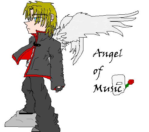
>Angel of Music
>Angel of Music
>Angel of Music by BlackPaint

Description
Description
....*dies* I accually drew this, with a mouse, freehand, on paint! Its also colored on paint.... I ahte paint... I accually like how it came out! its the Phantom without his mask. I thought he was hott both ways! Oh yeah, he is standing on a rock, don't ask why, he just is. The wings r SOOOOO crappy! I worked so ahrd on them 2 *sob* Welllllllllll, I'll take requests....not that anyone wud want one from me....*sob* my scanner is still broken T.T, and I accually had a nice scanner that didn't totally ruin pictures! Oh well, plz comment!
General Info
General Info
Ratings
Category Movies » Phantom of the Opera
Date Submitted
Views 1611
Favorites... 1
Vote Score 0
Category Movies » Phantom of the Opera
Date Submitted
Views 1611
Favorites... 1
Vote Score 0
Comments
9
Media Unspecified
Time Taken
Reference
Media Unspecified
Time Taken
Reference
Comments
You are not authorized to comment here. Your must be registered and logged in to comment
diablo on June 1, 2006, 5:41:56 AM
diablo on
BlackPaint on May 30, 2006, 5:41:09 AM
BlackPaint on
alchemist151 on May 24, 2006, 5:38:12 AM
alchemist151 on
Kidding aside, my favorite part of this picture is the wings. Whenpeople draw wings (myself included) they are often drawn too small, orwithout the right amounts of joints or feathers. The wings in yourpicture look as though they could actually be used for say, flight.
The main change I would make in the picture is shading. You have linesto imply folds in the clothing, and that's good, but you don't haveshadow underneath those lines, and that's bad. I understand that if youare working with a program like MSpaint, shading is not easy. But, ifyou really wanna step up your art, give it a shot. If not, it is stilla decent picture. Ta! ^^
niobe on May 8, 2006, 6:31:07 AM
niobe on
BlackPaint on March 24, 2006, 8:27:14 AM
BlackPaint on
Eriks_Angel on March 21, 2006, 5:01:27 AM
Eriks_Angel on
BlackPaint on March 3, 2006, 6:16:16 AM
BlackPaint on
Angel-of-Music on February 26, 2006, 12:01:33 AM
Pin-Striped-Skelly on February 5, 2006, 2:28:17 AM
Though it saddens me how many people think the phantom is supposed to be "hot"... No offense meant of course. Nice pic either way ^^ I'm just a leroux/Kay enthusiast.
For those who don't know... Gaston Leroux = Made the Original Phantom. Read the novel. ^^
