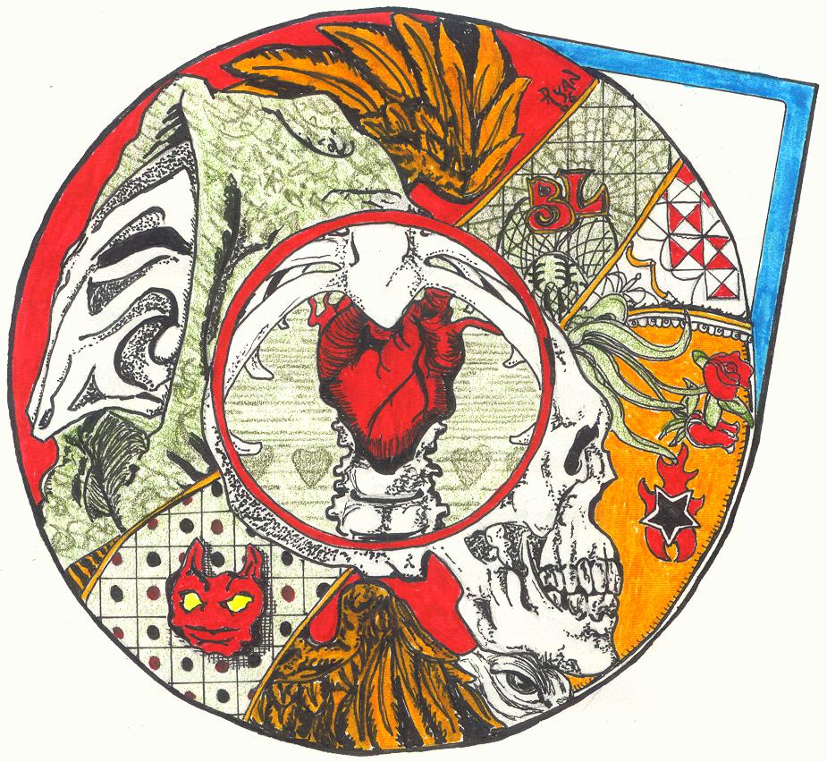
Keep Staring at my Heart
Keep Staring at my Heart
Keep Staring at my Heart by Bleak_Lead

Description
Description
Its Halloween Time, or at least the commercials tell me so... Wutever the Season, I threw alot of effort into this piece, and if u would be so kind as to lend me a moment of your time I will explain the jumbled mess before you. It is a fragmented collage of heavy detail that I tried to make so complex the eye would be drawn to the simpler center of the piece, The heart. Now the overall shape and outline is meant to resemble an eye and the contents outside the pupil have the themes of the beauty, peace, mystery, and anxiety all attached with death but in the center of all is love... wut some believe really matters, in my case I was just looking for something to fill that big gaping hole in the middle of my picture of death. Anyway Im sure u can find more than I originally intended if u look at it long enough and I'd love to hear about it so give me a comment.
General Info
General Info
Ratings
Category Miscellaneous » Gothic/Romantic
Date Submitted
Views 1199
Favorites... 1
Vote Score 1
Category Miscellaneous » Gothic/Romantic
Date Submitted
Views 1199
Favorites... 1
Vote Score 1
Comments
6
Media Ink or markers
Time Taken 8 hrs.
Reference medical anatomical sketches
Media Ink or markers
Time Taken 8 hrs.
Reference medical anatomical sketches
Comments
You are not authorized to comment here. Your must be registered and logged in to comment
GoDancetheSound on July 1, 2008, 10:35:06 AM
Nightwalk_dream on June 21, 2007, 10:10:39 PM
Juan_David on December 16, 2006, 7:28:01 AM
Juan_David on
Bleak_Lead on December 13, 2006, 6:15:39 PM
Bleak_Lead on
FallenAngel0792 on October 19, 2006, 7:13:40 AM
Trinity_Fire on October 19, 2006, 7:07:27 AM
Trinity_Fire on
How awesome~!! I do love the center 'hollow' of the heart and the ribs, and detailing around the edge is all quite lovely... Like the angel wings there, and the two opposing/back-to-back black and white faces... yes, you've obviously put quite a lot of thought to this.
Absolutely beautiful job.
I LOVE your art. ;o;
