Username   Password  
Remember   Register   |   Forgot your password?

Tifa

Tifa

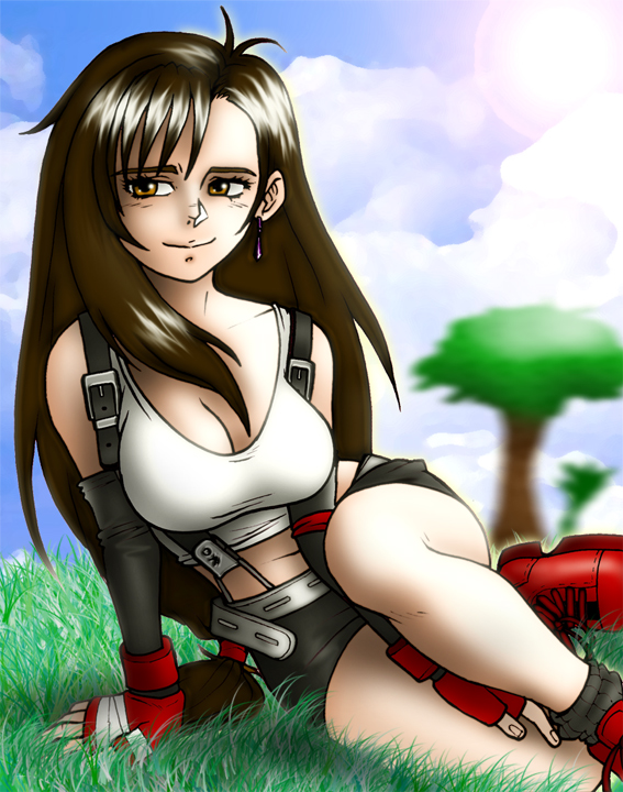
Tifa by Cerberus_Lives
Description

Description
Cerberus_Lives
A softer, less crudely-sexualised Tifa than I would normally do... But I like it!

General Info

General Info
Ratings
NSx

Category Games » - by Publisher » Square-Enix » Final Fantasy series » Final Fantasy 7 » Tifa
Date Submitted
Views 2158
Favorites... 10
Vote Score 6
Comments 12
Media Digital drawing or painting
Time Taken
Reference Some

Comments

Comments (12)

You are not authorized to comment here. Your must be registered and logged in to comment

lightningscion on August 28, 2007, 8:27:20 AM

lightningscion on
lightningscionAh...um, kinda speechless here. God you do brilliant Tifa art. That smile.wow...

GeneralOnion on May 21, 2007, 8:17:38 PM

GeneralOnion on
GeneralOnionshe still looks super hot

357 on May 20, 2007, 7:00:15 AM

357 on
357Really nice pose, great coloring, and I like the background too! ;P

The_S on May 20, 2007, 4:27:56 AM

The_S on
The_SEven though I love OMGUBERSEXUAL Tifa, this is very nice... I like this softer side of her, the side she shows Cloud.

wish4love on May 20, 2007, 2:55:28 AM

wish4love on
wish4lovepretty colorin

iatap on May 20, 2007, 2:23:15 AM

iatap on
iatapI like it...but I would have sooo much liked to have been able to see up her skirt. :)

Cerberus_Lives on May 20, 2007, 1:22:12 AM

Cerberus_Lives on
Cerberus_LivesBloody comments glitching out again...

Trinity_Fire on May 20, 2007, 12:53:58 AM

Trinity_Fire on
Trinity_FireWow, I really like this! It's softer, to an extent yes, but I like it. Her face is really quite feminine here and all. How do you do those highlights in the hair?? It's so amazingly gorgeous~ @_@

zakuman on May 20, 2007, 12:24:40 AM

zakuman on
zakumanWell I can't exactly say you haven't shown us the softer sides of Tifa. So I'm thinking this is more or less the coy side of her. Cute image.

Ariya_Eretsee on May 19, 2007, 9:39:06 PM

Ariya_Eretsee on
Ariya_Eretseelove this piece of tifa, great posing and the expressions nice. all im wondering is why there is white shading on the left side while the sun is on the right. also her bangs over her face are a bit to much shaded I believe for the son coming from behind. also the nose might have looked better if you darkly shaded it on the other side. these are not meant as flamers just trying to help out ^^ keep improving your already a long way ahead.

Cerberus_Lives on May 19, 2007, 9:45:02 PM

Cerberus_Lives on
Cerberus_LivesThanx for the comments - I agree, the shading suggest that the sun should much further to the right and slightly in front of her, guess I kinda blassed it up a bit! Oh well! :P

Cerberus_Lives on May 19, 2007, 9:46:02 PM

Cerberus_Lives on
Cerberus_LivesThat should have been 'ballsed up'...