III. Reflected in Dark Water
III. Reflected in Dark Water
III. Reflected in Dark Water by DarkLink2803

Description
Description
Third addition to the Ocarina of Time 'Awaken the Sages' Series of Six;
I. Phantom Forest [link]
II. Temple of Fire [link]
III. Reflected in Dark Water
IVi. Under the Well [link]
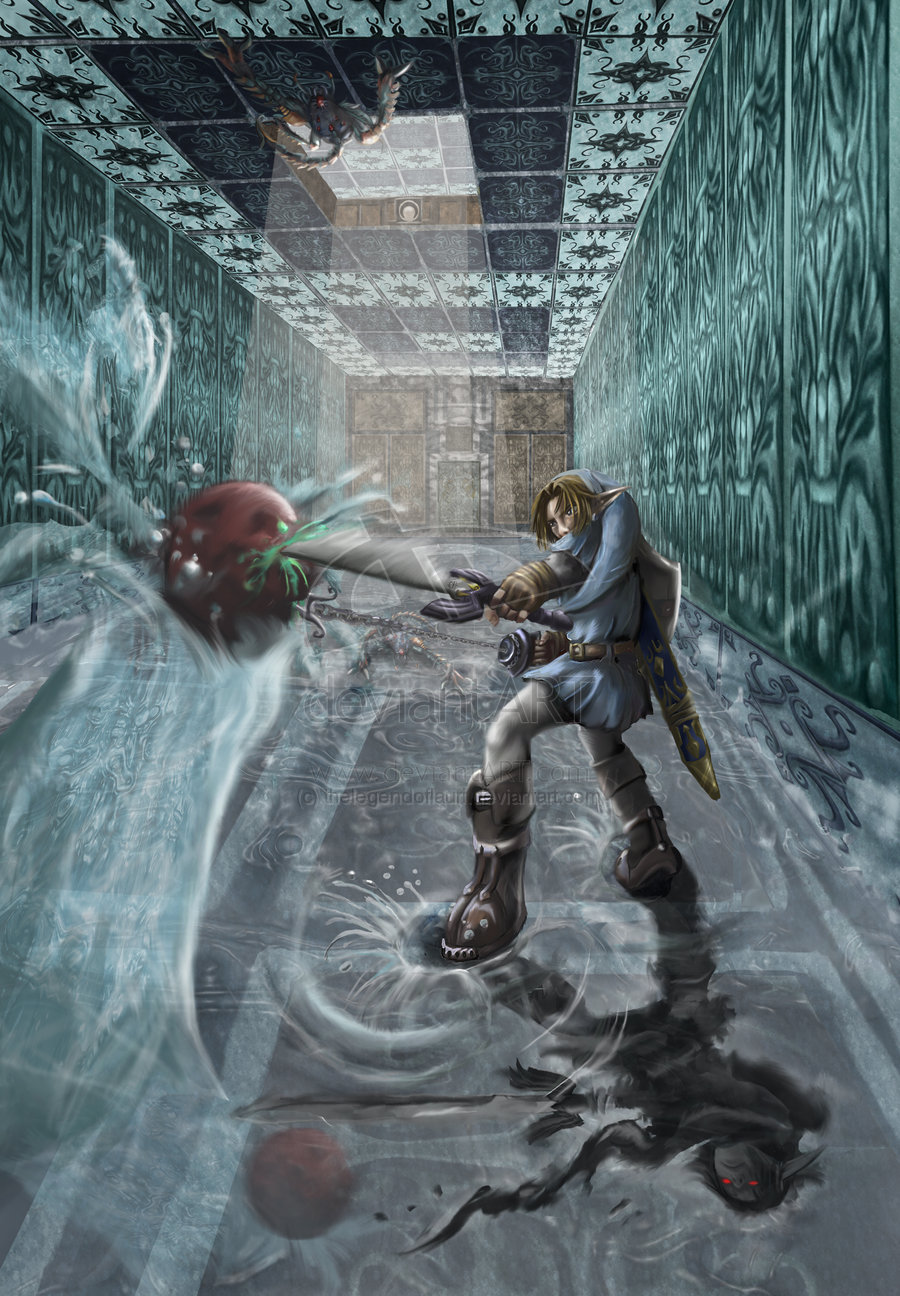
I can't wait to get started on the Shadow Temple, I think I'm much better at drawing pictures with darker backgrounds. I tried to follow the basic colour scheme of the Water Temple in this picture but all of the tile designs are totally original (apart from the hookshot symbol! It's from memory so probably wrong XD) I might upload close ups of some details later.
This took forever... especially all those tiles. I still wouldn't say this picture was fully completed so !constructive! critique is definitely appreciated :) two changes because of your crits have already been made, but more are always welcome!! Special thanks to WishIWould for especially awesome concrit :D
If you think Link's reflection looks dodgy, take a closer look :evillaugh: Thanks!
General Info
General Info
Ratings
Category Games » - by Publisher » Nintendo » Legend of Zelda series » - Ocarina of Time
Date Submitted
Views 2210
Favorites... 13
Vote Score 8
Category Games » - by Publisher » Nintendo » Legend of Zelda series » - Ocarina of Time
Date Submitted
Views 2210
Favorites... 13
Vote Score 8
Comments
9
Media Digital drawing or painting
Time Taken 25+ hours
Reference NONE!
Media Digital drawing or painting
Time Taken 25+ hours
Reference NONE!
Comments
You are not authorized to comment here. Your must be registered and logged in to comment
lashanta22 on January 19, 2011, 4:48:26 AM
lashanta22 on
courtneyyylouise on August 29, 2009, 9:31:45 AM
BadArtist on September 16, 2008, 4:13:47 AM
BadArtist on
Flarethehedgie on August 31, 2008, 10:18:36 AM
kylethehedgehog on August 30, 2008, 10:04:14 PM
AylaMarine on August 26, 2008, 10:19:04 PM
AylaMarine on
DistantDragon on August 26, 2008, 2:01:59 AM
TwilightDragon on July 27, 2008, 4:16:43 AM
First: the angle of Shadow Link's nose. It looks maybe a little flat. If it was pointed a bit more toward the "camera" it would help.
Second: I don't know if this was intentional or not, but Shadow Link's head isn't in the same position as Link (as it would be if he were an actual reflection). From that angle, Link's arm would be covering his face. You're picture shows Shadow Link with more face showing than regular Link... I actually like it better the way you have it, though, gives Shadow Link more personality and separates him from regular Link.
Anywho, I can't complain. This piece if beyond stunning. All those tiles.. An instant fave! ^^
Dimensionlu on July 18, 2008, 11:41:01 AM
Dimensionlu on
