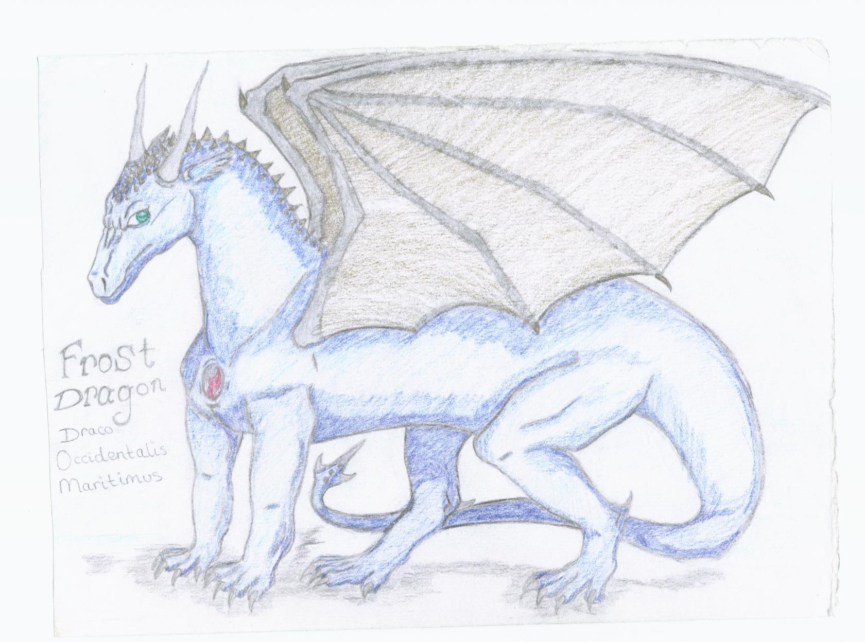
Frost Dragon
Frost Dragon
Frost Dragon by Frost_Dragon

Description
Description
General Info
General Info
Ratings
Category Fantasy » Dragons » Elemental Dragons » Ice/Snow Dragons
Date Submitted
Views 2551
Favorites... 9
Vote Score 0
Category Fantasy » Dragons » Elemental Dragons » Ice/Snow Dragons
Date Submitted
Views 2551
Favorites... 9
Vote Score 0
Comments
16
Media Unspecified
Time Taken
Reference
Media Unspecified
Time Taken
Reference
Comments
You are not authorized to comment here. Your must be registered and logged in to comment
Whatsername on November 5, 2005, 12:00:17 AM
Whatsername on
Neziko on September 3, 2005, 10:24:36 PM
Neziko on
Rasputin on July 17, 2005, 9:50:19 AM
Rasputin on
Alucards_Bane on June 28, 2005, 10:51:01 PM
DungeonsAndDragonsFreak on June 21, 2005, 2:51:36 PM
AZNgummigurl on June 18, 2005, 7:52:39 AM
AZNgummigurl on
Stealth_Nerd on June 10, 2005, 9:56:38 AM
Stealth_Nerd on
YamiHana on June 3, 2005, 2:19:35 AM
YamiHana on
Cara on May 10, 2005, 4:02:47 AM
Cara on
aqua_kitty on April 16, 2005, 8:39:22 PM
aqua_kitty on
Frost_Dragon on April 16, 2005, 8:34:06 PM
Frost_Dragon on
aqua_kitty on April 16, 2005, 8:30:34 PM
aqua_kitty on
Frost_Dragon on April 16, 2005, 8:22:21 PM
Frost_Dragon on
aqua_kitty on April 16, 2005, 8:20:00 PM
aqua_kitty on
dj_gamer_girl on April 4, 2005, 2:43:06 AM
Stratadrake on March 28, 2005, 8:05:07 AM
Stratadrake on
Personal opinions by me about this dragon are:
- The main 'arm' of the wings should probably have more muscle to it, to make them look stronger.
- How come the small ridge of spikes on his neck doesn't extend down his full spine?
- His back legs don't quite match up, proportion-wise. The far leg feels too far forwards to me, as if it wasn't built into the drawing's composition as well as the others.
- The colors are a little washed-out, too bright. If you look around on your scanner utility's menus, you should be able to find some exposure controls you can tweak to improve the tones & colors of the drawing when it's scanned. (Specifically, if you tweak the "midtones" value down slightly, the colors will look more vivid)
- Stellar job on the head and face, I like it. The neck feels about the right length by my standards, and although the tail seems a little thin, it seems about the right length too.
What else can I say? Nothing that a lot more practice and experimenting won't already improve upon, so that's it for now.
