Sketch
Sketch
Sketch by Gartenschlauch

Description
Description
General Info
General Info
Comments
8
Media Graphite pencil
Time Taken 3h
Reference
Media Graphite pencil
Time Taken 3h
Reference
Comments
You are not authorized to comment here. Your must be registered and logged in to comment
wrdkiki on December 12, 2009, 11:34:20 AM
wrdkiki on
Takahashi2Oki on December 3, 2009, 9:44:38 PM
Living_Dead_Girl on November 1, 2009, 3:55:19 AM
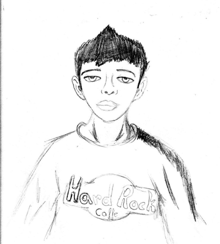
What I like: Impressive for a beginner. You didn't ignore the folds like most people do. You've got some noticeable shading. The head is in proportion to the body. Woot Hard rock Cafe`! ;D
Suggestions for improvement: I'll try to give info that would be useful for more than just this picture. Just as a reminder in case you don't know, the eyes should be in the center of the head, and the ears should be on the same level. They mostly fit the bill, but they are just slightly off. Methinks that with the shading, it would be a great idea to keep your strokes at the same angle. I notice some messy cross-strokes in the hair, and that really messes things up. If you try to copy the flow of the strands for hair and keep to the same angle for shading, it'll look much cleaner.
Overall, as I said, quite nice for a starter. Woot! =D
Gartenschlauch on November 3, 2009, 7:00:49 PM
Living_Dead_Girl on November 4, 2009, 3:55:07 AM
luckylace222 on October 12, 2009, 7:09:56 AM
luckylace222 on
Falconlobo on August 26, 2009, 10:49:23 AM
Falconlobo on

oh! thanks for the fav on my drawing <3