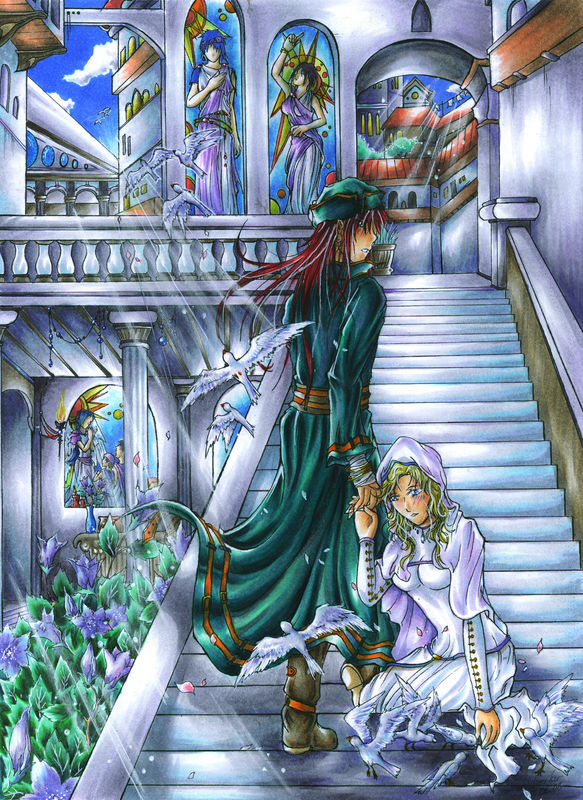
Bells for Her - Second Take
Bells for Her - Second Take
Bells for Her - Second Take by Genarog

Description
Description
Maybe you remember my JoshuaxNatasha picture 'bells for her' from way back, when I first joined dA...
If you don't take a look ...but don't laugh ^^"
http://www.fanart-central.net/pic-564958.html
Well anyway, since this is one of my most popular fanart - even though it royaly sucks - I decided to do a remake.
Whoring myself for comments...who, me??? I would never, ever do such a thing...oh well, maybe. A little bit ^^"
Haha...Just kidding. I just know I can do better now.
Hope you think so too!
General Info
General Info
Ratings
Category Games » - by Publisher » Nintendo » Fire Emblem series
Date Submitted
Views 1716
Favorites... 2
Vote Score 2
Category Games » - by Publisher » Nintendo » Fire Emblem series
Date Submitted
Views 1716
Favorites... 2
Vote Score 2
Comments
8
Media Ink or markers
Time Taken
Reference
Media Ink or markers
Time Taken
Reference
Comments
You are not authorized to comment here. Your must be registered and logged in to comment
LordessAnnara14 on November 1, 2009, 11:15:54 AM
fireandice1213 on March 11, 2009, 8:50:55 AM
MeruMeru on February 28, 2009, 4:36:29 AM
MeruMeru on
Genarog on February 28, 2009, 4:47:04 AM
Genarog on
blackcatcurse on February 28, 2009, 3:59:56 AM
Genarog on February 28, 2009, 4:31:14 AM
Genarog on
Dark_Assassin92 on February 28, 2009, 4:05:02 AM
Genarog on February 28, 2009, 4:27:20 AM
Genarog on
I'm glad that you like the picture. And you are right about the patience thing - it is actually one of the pictures that took me the longest to finish, besides maybe
But if you really want to look at some amazing details - which would drive my absolutly crizy - check out my friends pictures at dA....
http://gloriasangelus.deviantart.com/gallery/
And you are probably right about the anatomy issues, like the Joshua's strange head and overall posture, too. The architecture is funny in some places too. The outlines were actually done last year and I just colored them now, so you better not ask me what I was thinking when I did them ^^

Ho....
....Ly....
...Crap.
!!0_o!!