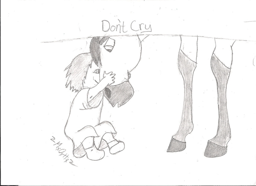
Don't Cry, I didn't mean it...
Don't Cry, I didn't mean it...
Don't Cry, I didn't mean it... by HorseSpirit

Description
Description
Click the picture. The larger version looks better! We'll this is the scene where the girl stretched out Spirits nostrils and Spirit knocked her down. Then she started to cry so he went down to say sorry. We'll guys it's official. I cannot shade my pictures! The proportions don't look right either! I must have been having an off-day or something. Can you guys give me some tips on shading??? I can't seem to get it right! Comment honestly!
~~HorseSpirit~~
Even though this pic isn't very good...I do take requests =)
~~HorseSpirit~~
Even though this pic isn't very good...I do take requests =)
General Info
General Info
Ratings
Category Movies » - Dreamworks Movies » Spirit: Stallion of the Cimarron
Date Submitted
Views 1494
Favorites... 2
Vote Score 0
Category Movies » - Dreamworks Movies » Spirit: Stallion of the Cimarron
Date Submitted
Views 1494
Favorites... 2
Vote Score 0
Comments
10
Media Unspecified
Time Taken
Reference
Media Unspecified
Time Taken
Reference
Comments
You are not authorized to comment here. Your must be registered and logged in to comment
xSpiritx on May 27, 2008, 6:41:02 AM
xSpiritx on
SilverLiningCloudy on October 7, 2006, 12:01:59 PM
heylorlass on June 7, 2006, 7:54:28 AM
heylorlass on
Remember when you are shading, it all depends on the pressure you put on your pencil. The harder you press the darker the shade, and you need to press very lightly for almost white shading. If you leave it white, it looks like a bare patch in your picture so always go over it very very lightly in a light shade almost white. It always looks better with the semitones in between! Another tip! It might seem obvious, but if you want something to look like it goes down- make it darker, or if you want something to look raised up, lightly shade it to make it look 3-D (And remember to shade in all the tones in between the darkest and the lightest and don't have them abruptly stop and start into each other.)
I hope this helps! =0)
Redwall_Artist on March 8, 2006, 9:54:58 AM
pookyns-5 on February 25, 2006, 10:52:14 PM
pookyns-5 on
lunar_goddess_of_the_moon on February 22, 2006, 7:18:57 AM
boribaby on February 22, 2006, 5:57:38 AM
boribaby on
perfectpureblood on February 20, 2006, 5:23:55 PM
dragon45 on February 20, 2006, 9:22:06 AM
dragon45 on
spiritrain on February 20, 2006, 8:49:23 AM
spiritrain on
