A&D- Page 1
A&D- Page 1
A&D- Page 1 by KingdomHeartShera

Description
Description
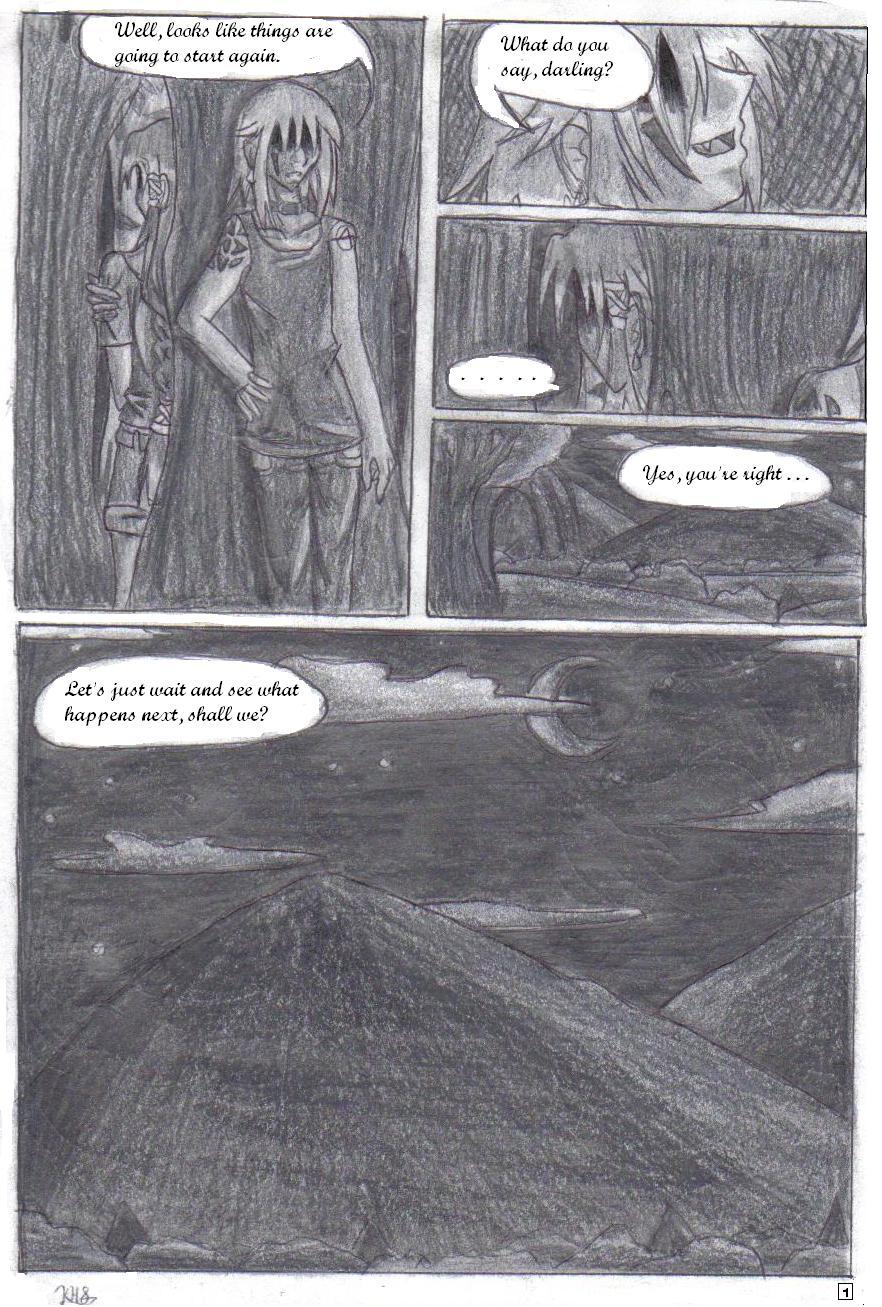
'Tis the first page of my original shounen-ai manga, "Advocation and Devotion." =3 Both people you see here are some of the main characters, but their identities won't be revealed 'til much later. Yesh, they're both men. Yesh, they have long hair. If you've seen any of my original characters, you know that I like long hair. =3 It's labeled shounen-ai 'cause he calls the other one 'darling', referring to thier relationship. XD
Roight. So, I totally loath how this turned out. The shading's so dark 'cause it's night, but I HATE how it looks. T_T Hate, hate, hate, hate, hate. I don't know what to do about it, though. I might redraw it, so this might just be a temporary picceh. ^^;; Meh. Trinity-san, help?
ZOMFG, it went up before the cover was approved. XD
*Edit* And hey, the slightly-better shading version of the page ish up! Boo-ya! ^^
~*~*~*~*~*~*~*~
Cover : http://www.fanart-central.net/pictures.php?pid=641338
Next: http://www.fanart-central.net/pic-644528.html
-------
Advocation and Devotion belong to KingdomHeartShera. Any stealing of the characters or story without my permission will be penalized. I'll sic Adin on you, bishes! =0
General Info
General Info
Ratings
Category Comics » - Original Comics » - Pages & panels
Date Submitted
Views 1300
Favorites... 1
Vote Score 4
Category Comics » - Original Comics » - Pages & panels
Date Submitted
Views 1300
Favorites... 1
Vote Score 4
Comments
14
Media Graphite pencil
Time Taken
Reference
Media Graphite pencil
Time Taken
Reference
Comments
You are not authorized to comment here. Your must be registered and logged in to comment
Puffstoole on November 26, 2007, 7:06:36 AM
Puffstoole on
Comment Deleted
KingdomHeartShera on November 27, 2007, 4:58:49 AM
Saru_no_Cheesecake on November 14, 2007, 5:58:10 AM
Everything looks really great! I couldn't do anything like this in a pink fit! Great job! I look forward to the next page with bated breath and excited fidgeting (maybe some squeals too for Lael-darling and Adin-kun ^_^;;)
KingdomHeartShera on November 15, 2007, 4:49:54 AM
Ah, don't be silly. I can imagine your manga being ultra-adorable! ^^ Your character designs are too awesome for it not to be great. I actually have quite a few pages planned, but five more need to be sketched and two need to be fully shaded. Don't worry, I'll have them to you some point soon! There's plenty of Lael, but takes a few pages for Adin to show up. =3 *loves* Thankies for ze comment! ^^ <333
Gerudowolf on November 13, 2007, 5:34:45 AM
Gerudowolf on
KingdomHeartShera on November 13, 2007, 6:04:41 AM
Chibichan on November 11, 2007, 9:53:21 AM
Chibichan on
KingdomHeartShera on November 12, 2007, 2:07:59 AM
Trinity_Fire on November 7, 2007, 5:59:19 AM
Trinity_Fire on
I think what really lessens the effect of this page is no value change. I mean, yeah, the clouds are lighter than the night sky which is darker than the hills, but it's all one flat base. Now, particularly in the last panel, would be an excellent place to put that light source thing into play! Where's your light source? The moon, of course. Don't make it so gray; the moon is white, and in a b&w picture, it's pretty darn close to all-white. Don't be afraid to show that!
Now, where else would you have highlights? On the clouds by the moon, of course, at the edges of them and perhaps a little less near the center. You may not think about it, but there's really differences in the lighting of the sky focused on the moon; near the moon, the sky should be slightly lighter, but the further away you move, the darker it gets.
And don't forget to shade the surfaces. The hill's left side (our left) would be dark, and the other side lighter at the top but darkening as you move down, y'see?
And you can also apply this idea to the other panels of the page. Pick out a few small, bright highlights on the characters (usually in the hair) and make sure they still somewhat stand out from the background.
Also, a good tip here would be to darken as you move down the picture, vertically. The further down you go, the less light there is, right? Try to remember that, and to apply it to your picture here. Otherwise, the objects in the panels all look much too flat. A single darker shadow could really help accent your picture and make it more realistic. :)
But hey, I personally still think it's pretty nice. :) Don't give up; keep trying! Nice page so far, and I'm loving your beautiful bishies. :D
KingdomHeartShera on November 7, 2007, 10:10:56 PM
Trinity_Fire on November 8, 2007, 9:34:56 AM
Trinity_Fire on
Honey, no, don't say that. I'm terribly sorry; I totally know what you were going for. I'm sorry I couldn't pick up on your shading~ maybe it was the scanner? But please, don't give up don't give up~ you're really amazing. Seriously. You're MY role model, did you know that?? You try out new things and attempt to better yourself so much more than I do... I bash my head against walls and still don't learn my lesson. (And you still draw better female figures, hahaha.)
Don't give up. Please. *hug*
And, it's not all your fault! Do you have a variety of shading pencils? 6Bs and 8Bs will give you hugely different effects from using regular HB pencils, so a lot of shading (like the professional kind you see) is done with artist-grade material.
I love your art though, and your characters, and your style!! Don't you stop now!! You're not silly or stupid in any way. :(
KingdomHeartShera on November 9, 2007, 4:54:43 AM
. . . Seriously? o.O Silly child, you're teh awesomness! You're my mentor-lady. <333 And you're totally amazing in every way possible. I LUVE you! ^^
And nuu, I don't have any different pencils beside the normal ones. I'll try to get my hands on some, but until then it'll all be done with a normal pencil. ^^;; Blegh. But thank you so much, you lifted me back up! I luve you! X3 *loveslovesloveslovesloves*
