When Anger Management Fails
When Anger Management Fails
When Anger Management Fails by LadyAnime79

Description
Description
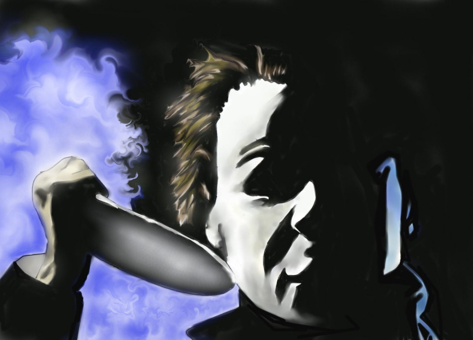
Well here is number two in my tribute to old school horror movie villains. Most of you should know who this guy is and if you don''t you should be beaten with your own leg. >< I was surprised that this didn''t take me too long to do. That could be because I didn''t have to use that many colors. Plus having it mostly black helped out too. Enjoy the pic.... while you still can.... mwahaha!
General Info
General Info
Ratings
Category Movies » - Suspense / Horror Movies
Date Submitted
Views 1516
Favorites... 2
Vote Score 1
Category Movies » - Suspense / Horror Movies
Date Submitted
Views 1516
Favorites... 2
Vote Score 1
Comments
5
Media Airbrush
Time Taken 2 hours
Reference Some pic from the net
Media Airbrush
Time Taken 2 hours
Reference Some pic from the net
Comments
You are not authorized to comment here. Your must be registered and logged in to comment
inuyasha_naruto_lover on August 30, 2006, 7:06:47 AM
i_know_i_die on June 4, 2006, 4:52:55 PM
i_know_i_die on
ShadowGurlie on May 30, 2006, 5:37:46 AM
ShadowGurlie on
CathyVoorhees on May 26, 2006, 6:13:00 AM
CRaYoNBoY on May 24, 2006, 1:36:19 PM
CRaYoNBoY on
http://img.photobucket.com/albums/v516/xxjc84xx/422282.jpg
By doing this it gives his face more form and dimension. It also pops the other part of the face out a lil more which I think you want the viewer to notice, right?? Anyway hope that was useful. Keep up the great drawings!
