Username   Password  
Remember   Register   |   Forgot your password?

The Very Secret Diary

The Very Secret Diary

The Very Secret Diary by Malefice

Description

Description
Malefice
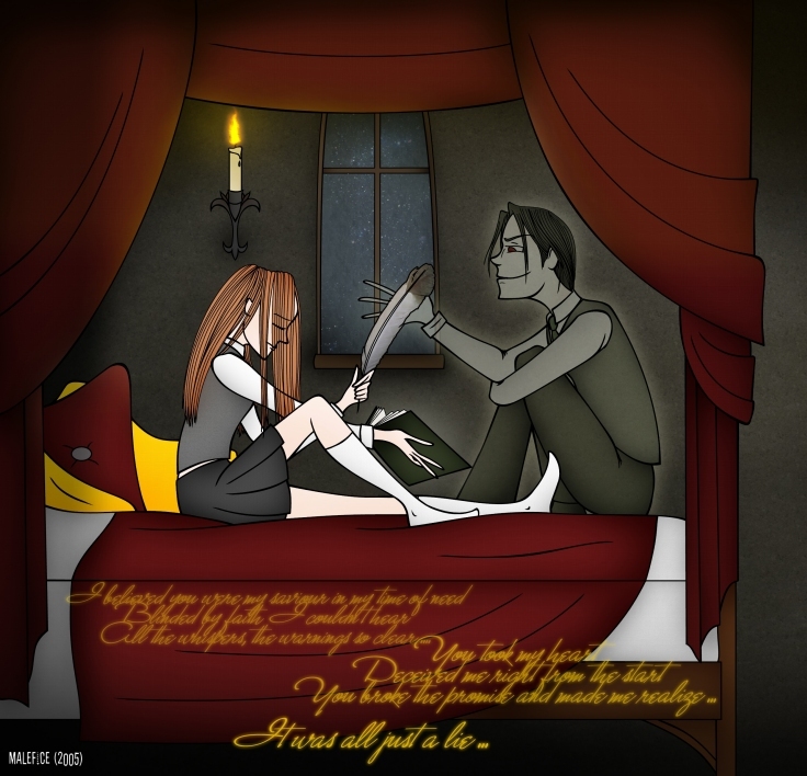
^^ Probably the most detailed background I ever made. Eh and Ginny's leg looks a bit weird o_O Anyway, it's inspired by Arabella's wonderful fanfic 'The Very Secret Diary' (can't find the link right now, sorry) And the lyrics are from Within Temptation's 'Angels', I love that song :)

General Info

General Info
Ratings
None

Category Books » Harry Potter series » Characters & Fanart » - All Characters » Ginny Weasley
Date Submitted
Views 2475
Favorites... 1
Vote Score 0
Comments 9
Media Unspecified
Time Taken
Reference

Comments

Comments (9)

You are not authorized to comment here. Your must be registered and logged in to comment

KC_Jones on June 8, 2006, 7:36:00 AM

KC_Jones on
KC_JonesAm I the only one who, despite the book, sees this as a good pairing?

ybecool on April 17, 2006, 9:49:00 AM

ybecool on
ybecoolugh u did FINE jeez those people are just PARaNoID!

ybecool on April 17, 2006, 9:48:18 AM

ybecool on
ybecooli no ur art rite wen i c it i like ur style art its really interesting differnt and AwEsOmE!

katlou303 on March 9, 2006, 9:09:36 PM

katlou303 on
katlou303I just want to say that I have seen many artists who draw in this style but none quite measure up to you.

weasleygirl on January 30, 2006, 7:03:05 AM

weasleygirl on
weasleygirlwat envied chaos said. and i see a mistake too. the hand thats holding the book of ginny's should be on the bind thing,not showing the thumb. or something like that...i'm sure u can imagine wat i'm talking about. but it's good either way! nice job with tom!

Malefice on October 22, 2005, 6:13:04 AM

Malefice on
Malefice@ Envied_Chaos: Thanks for your comment and for pointing these things out, that's exactly what I call constructive critcism :)

Envied_Chaos on October 22, 2005, 5:47:33 AM

Envied_Chaos on
Envied_ChaosWow! I love this picture to death! I like the glowy transpartent effect on Tom, and the way you visioned him. There are a few mistakes that I'd like to point out though.

-Ginny's head shouldn't curve in the way it did.
- The leg looks too long for her body, and the fingers on the hand holding the book look a little long too.
-You did a great job on this picture, but the last thing I want to point out is Ginny's face. It doesn't look soft like a girls is. She rather looks like a tough tomgirl. ^_^

But yeah, that's all I can spot wrong with it. Great job!

Lychee on October 22, 2005, 1:50:18 AM

Lychee on
Lycheeo.O wowow! This is awesome! *favez* this rocks! and the colours are so clear!

Sakura_Sagara on October 22, 2005, 1:44:03 AM

Sakura_Sagara on
Sakura_SagaraPay no mind to 'da rater'- he's just 'da idiot'. I've not seen him post a picture, so he can't say much about art and skills. And especially a digitally done art piece! The lines are smooth and awesome, the colors are cool, especially the way Tom is all transparenty, and I love how you drew Ginny! I really like your style of art. It's unique and I like the effect the words and lyrics have on the picture. Great job.