Another Ninata for Bullsnake
Another Ninata for Bullsnake
Another Ninata for Bullsnake by Master_Chief60

Description
Description
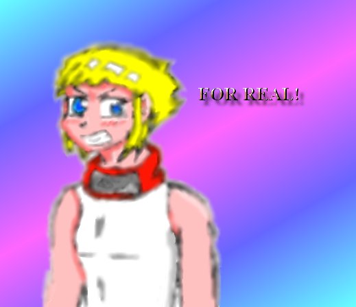
Well, personally, I think this one turned out better than the other. I had some trouble blending her in with the background gradient though. This one definatly took me longer then the other (if you can tell, but I don't htink you can) because I did it with 2 different programs. I did her outline with MS paint and the coloring and blending with JPSP. Tell me if you like this one better then the other, because I think I do. Sorry about her fuzzy outline though. As I said, I'm bad with blending with the background.<br />
<br />
Anyway, if it doesn't look like an improvement from the previous one, sorry about that and I'll try harder next time.
<br />
Anyway, if it doesn't look like an improvement from the previous one, sorry about that and I'll try harder next time.
General Info
General Info
Comments
2
Media Unspecified
Time Taken
Reference
Media Unspecified
Time Taken
Reference
Comments
You are not authorized to comment here. Your must be registered and logged in to comment
Master_Chief60 on May 17, 2006, 5:19:20 AM
Bullsnake on May 17, 2006, 2:40:24 AM
Bullsnake on
However, I wouldn't blend the character in with the background next time. It'd look better if the figure was sharp and removed from the background rather than blended in with it. When you blend them together, you're no longer distinguishing between foreground and background and so there's no depth (in this case everyone knows Ninata is the focal point because the pic is about her, yet since she's so blurry she's pushed back rather than pulled forward).
Also in this pic, since you left the "for real" sharp, it becomes the foreground and Ninata and the gradient become a combined background.
I think if you can, you should upload this pic w/o Ninata blurred. It looks good now, but I think it'd look even better that way ^^

Good thing I saved the lineart as a separate file! I'll do better with it today and I'll show you what I came up with later.