He Was a Friend of Mine -finished-
He Was a Friend of Mine -finished-
He Was a Friend of Mine -finished- by MitchellP

Description
Description
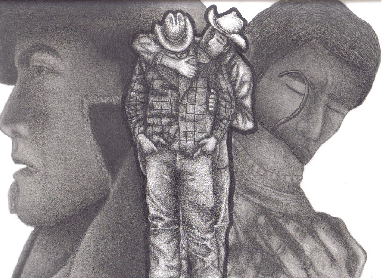
Time for my little description of my pic. I decided to put it under the books catergory instead of the movie catergory. Hope you all enjoy it and PLEASE COMMENT ^_^
Well to begin with I'll start with the title of my pic. I chose to use the song's title that plays at the end of the movie because the first few lines says so much about how much Ennis misses Jack and how close Jack was to him:
" He was a friend of mine, Everytime I think of him I can't keep from crying, Because he was a friend of mine...." (He Was a Friend of Mine- Bob Dylan)
Thus, from those few words I decided to use the scene from where Ennis finds Jack's secret memento of their time together at Brokeback. Trying so hard to seek out the old scent of Jack and remembering the time they had spent together:
"....hoping for the faintest smoke and mountain sage and salty sweet stink of Jack but there was no real scent, only the memory of it..." (pg. 283 Close Range: Wyoming Stories)
The middle image was hard to do because I wanted to give them texture and make it look as if it was a moment captured in time, a mental photograph:
"...Reliving your experiences, How lovely they are, So crisp so clear, A mental photograph captured in time...." (taken from my poem "The Silent Embrace")
I also added a dark border around them not to make them stand out but to symbolize that they stood as one making them complete:
"...the shadows of their bodies a single column against the rock..." (pg. 278)
The pose was easy to choose because it displays how close they were and it's the one image inwhich Jack enjoyed the most:
"...that dozy embrace solidified in his memory as the single moment of artless, charmed happiness in their seperate and diffucult lives..." (pg. 279)
I wanted the profile of Jack to be sort of hazy because although he exists fictionally he actually exists in each of us whether we want to believe it or not. I also wanted him to be somewhat dark and not really stand out because I wanted it look as if it was part of a dream. You can never see the image clearly in your dream.
"...around that time Jack began to appear in his dreams, Jack as he had first seen him..." (pg. 285)
Although the pic I used isn't actually the first time they had seen each other but rather the time inwhich they had accepted their sexual relationship amongst themselves:
"...saying not a goddamn word except once Ennis said, 'I'm not no queer,' and Jack jumped in with 'Me neither. A one-shot thing. Nobody's business but ours'..." (pg. 262)
I also made both background pics dark and I also didn't want to put too much detail in them because I wanted the viewers to focus upon the image in the middle rather than looking at the background images. They were the best of friends and yet never willing to accept that inwhich they desired.
As you can tell I used a lot of references from the book because it describes everything in such detail as they always do. It also allows the artist to be free of how they view a certain part of the story. The images I took from the movie because it had displayed the characters so well that I wanted to use them instead of making up my own. I think it would've lacked the emotion inwhich the book had described each character and event that was taking place.
I love using symbolism when I draw because it makes the viewers think about what they had either read or watched making them think back and having them dive deeper into the story or movie to get a better view of what the writer was trying to show us.
This is NOT a gay story/movie it IS a story about the true meaning of LOVE and how it can exist between two people whether it be the same sex or not. You must look beyond the images you see and look for the meaning of the story.
You must ask yourself this question.
What is it that they want us to understand?
Jack and Ennis (middle) was done with a 0.5 mech. pencil no blending I wanted to keep the texture. The two larger portraits were done with 0.5 mech pencil, 2-4b pencil (to make it dark) and blending was done with a q-tip, tortillion, and paint brush.
General Info
General Info
Ratings
Category Movies » -- Other Movie Not Listed » Other Live action
Date Submitted
Views 1572
Favorites... 3
Vote Score 1
Category Movies » -- Other Movie Not Listed » Other Live action
Date Submitted
Views 1572
Favorites... 3
Vote Score 1
Comments
9
Media Graphite pencil
Time Taken
Reference DVD Still Screen Shots
Media Graphite pencil
Time Taken
Reference DVD Still Screen Shots
Comments
You are not authorized to comment here. Your must be registered and logged in to comment
emozim on November 14, 2007, 6:08:41 AM
emozim on
DemoiltionLovers on August 21, 2006, 3:40:33 AM
Jo_Pen on April 16, 2006, 11:35:42 PM
Jo_Pen on
EmmyChan on April 13, 2006, 5:26:43 AM
EmmyChan on
marjan on April 12, 2006, 12:56:04 AM
marjan on
Roach_Chan on April 12, 2006, 12:34:29 AM
Roach_Chan on
Phoenix11 on April 11, 2006, 1:42:28 PM
Phoenix11 on
alot of your pics seem to be centered in the mid of the page but the pic over all looks good cause u always use all the - space in the paper..all your pics are great, tho maby try drawing from a diff movie, just a thought..
now for this pic!! Dun Dun DUn =P lol...the shading in the clothing is really good, berrer than i could do with pencil ^_^ but a couple things needs to be worked on.. the guys chin in the left is a bit to long and does not have enough highlights in his face his eye kinda blends into his face...the guy on the right has some lines showing that kinda give it a flat look.. for the guys infront they are good and in proportion..but one thing u could add, :Eve says *sorry for being picky* the hands in the pocket makes a slight bump in the fabric, cuz now they look like they are just sticking into his leg... the guy infront should be a lighter shade and more extreme lights..then the guy in back would not blend in as much with him... nice job with the hair but the guy on the right needs a part in his hair..well that is all i c that could be fixed and that is good =P yell at me if i missed anything!!! ^_^
keep up the flow of godly tallent
Eve
p.s plz don't smite me for being to judgemental to your pic lol =P
well bys =)
Amadeus on April 11, 2006, 12:41:24 PM
Amadeus on
