Username   Password  
Remember   Register   |   Forgot your password?

Miko

Miko

Miko by Moon_Bind
Miko by Moon_Bind

Description

Description
Moon_Bind
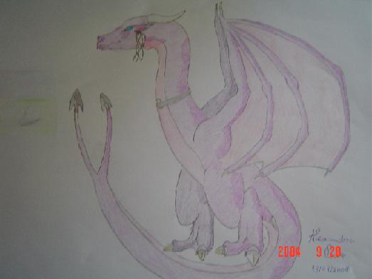
Other of my OCs. Miko. I messed up her head. Oh well. Coment please?

General Info

General Info
Ratings
None

Category Fantasy » Dragons » Wyverns
Date Submitted
Views 1592
Favorites... 1
Vote Score 0
Comments 11
Media Unspecified
Time Taken
Reference
Tags

Comments

Comments (11)

You are not authorized to comment here. Your must be registered and logged in to comment

Moon_Bind on April 7, 2006, 8:59:05 PM

Moon_Bind on
Moon_BindThis was back when I started drawing. If I had put the tail around her, I wouldn't know how to draw the paws :)

-Fridaythe13th- on April 7, 2006, 9:11:13 AM

-Fridaythe13th- on
-Fridaythe13th-It would be better if you made the tail actually around him and not on put the dragon floating above it, besides that AWESOME

Fairygurl27 on February 2, 2005, 12:31:43 PM

Fairygurl27 on
Fairygurl27i think you did a nice job, dark yes, but its still a nice picture! and i bet it took a while to get the shading right, you draw really well, i mean not every drawing is perfect, like mine for example there good but there not the best. ^^ Favs* this is a nice one your drew! :)

LinkDragodius on January 11, 2005, 11:40:44 PM

LinkDragodius on
LinkDragodiusIt aint the best dragon ever... But it's not that bad, I don't think.

Queen_Asheer5600 on January 8, 2005, 1:32:43 AM

Queen_Asheer5600 on
Queen_Asheer5600I really like the image even if it's chopping when you first look at it. I agree you should really ad more indepth features keeping it looking like she's not just floating there. If you ever need ref's for the wings just look at your hands, and imagine them with long fingers that have skin between them. That's how I do a lot of my images and I use refs for poses and everything, mostly in the horse department. The two tail ends don't seem to suit the dragon in my own opinion, I know it's probably in your design it's just that I really don't think it's needed in the full design.

Ogrim_Doomhammer on January 3, 2005, 2:07:47 AM

Ogrim_Doomhammer on
Ogrim_Doomhammeri really like him but it would look better if you didnt break the tail

Nemesisdragon on December 8, 2004, 4:59:16 AM

Nemesisdragon on
NemesisdragonDragon!! *huggles dragon* I love all the shading in it! You are really good at drawing dragons!!!

Noir_FFVII on October 14, 2004, 1:03:53 AM

Noir_FFVII on
Noir_FFVIICute picture of a dragon :D and I can try to do a MLP Kai for you :)

Moon_Bind on October 6, 2004, 1:26:56 AM

Moon_Bind on
Moon_Bindum...right, I can't master the shadows(^-~) It's too hard I have tryed they always come looking crapy! Um....I never got the human structure...and the tail? Ah well this one was realy only to show a friend of mine how she looked. I never had standing,ground,gravity or any other pose factors in mind but thanks for the comment! I love your drawings!

Stratadrake on September 27, 2004, 3:37:14 AM

Stratadrake on
StratadrakeWhat do you mean you screwed up on the head? I see absolutely nothing wrong with it!<br />
<br />
Okay, yes the picture is a litle dark around the fringes, but that's half-expected from using a digital camera, so I can't nag on it (much) -- the dim exposure setting makes the purple tones look faded, in some spots it's hard to see the color.<br />
<br />
As dragon physiology goes this one's pretty sound. The only things that bug me are the wings -- the "palm" joint of the wings (where all the partitions connect) should probably be a little thicker, after all wings are structured like arms with really long fingers. Also, if the dragon is standing on a flat surface (as the feet imply), then you shouldn't have the tail swoop down so low ("underground") like it does.<br />
<br />
Apart from those two I'd say you have mastered the dragon physiology pretty well, most of the improvement for future drawings will be in the areas of color and shading. I'd bet you'll be producing some absolutely stellar dragons six months or a year down the road....

Juli on September 26, 2004, 10:00:58 AM

Juli on

JuliThe picture quality is kind of dark, but i like what shading i can see.