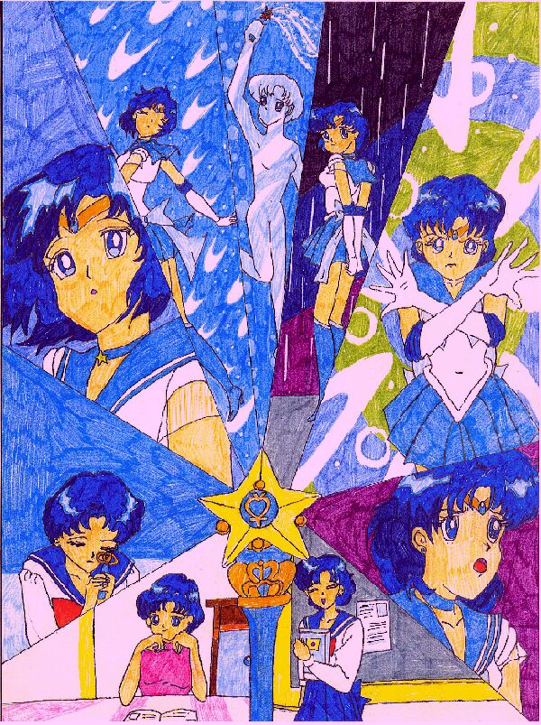
Sailor senshi Collage Series (part 1)
Sailor senshi Collage Series (part 1)
Sailor senshi Collage Series (part 1) by NeoCelestialStar

Description
Description
This is an OLD pic that is the first in a series of collage pics I drew. I originally drew this for the english voice actor for Sailor Mercury. The coloring job on these collage pics are less than perfect cause I still used markers back then (not copic obviously). Also, the scanner changed the colors a bit. More collage series pics to come! Any comments?
General Info
General Info
Ratings
Category Anime/Manga » Sailor Moon series » Sailor Scouts » Sailor Mercury (Amy)
Date Submitted
Views 2446
Favorites... 7
Vote Score 1
Category Anime/Manga » Sailor Moon series » Sailor Scouts » Sailor Mercury (Amy)
Date Submitted
Views 2446
Favorites... 7
Vote Score 1
Comments
5
Media Unspecified
Time Taken
Reference
Media Unspecified
Time Taken
Reference
Comments
You are not authorized to comment here. Your must be registered and logged in to comment
sailoraqua13 on November 1, 2007, 12:30:06 PM
sailoraqua13 on
Nightbird on April 13, 2006, 3:48:06 AM
Nightbird on
sugar2 on October 16, 2005, 8:06:40 AM
sugar2 on
NeoCelestialStar on May 9, 2005, 10:23:56 AM
Astronamymage on May 7, 2005, 3:17:44 PM
Good: I love her expression in the section on the far upper left corner. You seem to have captured her innocence in these pictures. Great facial expressions. There are so many different ones all in one pic! I still love the layout. The idea of centering pictures around thier wands is awesome. You draw different body positions well.
Bad:There doesn't seem to be much shading. The left hand of mercury in the upper right pic looks slightly bigger than the other.You can see the places where the coloring touched itself again, but I don't know how to fix that.
I hope this helps. :) Keep up the great work!
