colorful!?
colorful!?
colorful!? by NightmareRave

Description
Description
General Info
General Info
Comments
23
Media MS Paint
Time Taken 50 mins
Reference
Media MS Paint
Time Taken 50 mins
Reference
Comments
You are not authorized to comment here. Your must be registered and logged in to comment
luckylace222 on June 28, 2009, 3:50:07 AM
luckylace222 on
AnbuKakashi on December 10, 2008, 5:48:45 AM
AnbuKakashi on
moog1895 on August 27, 2008, 10:08:15 AM
moog1895 on
LD4Japan on July 21, 2008, 7:41:39 AM
LD4Japan on
NightmareRave on July 21, 2008, 7:43:06 AM
Volorios on July 16, 2008, 11:30:43 AM
Volorios on
SoraCooper on July 4, 2008, 10:20:32 AM
SoraCooper on
NightmareRave on July 4, 2008, 10:22:51 AM
SoraCooper on July 6, 2008, 6:31:23 AM
SoraCooper on
NightmareRave on July 8, 2008, 3:57:23 PM
BAMkid on July 1, 2008, 3:36:54 PM
BAMkid on
MetaKnight56 on July 1, 2008, 12:20:44 PM
MetaKnight56 on
qgcooper on June 28, 2008, 9:02:42 AM
qgcooper on
YnxoXIV on June 28, 2008, 7:11:50 AM
YnxoXIV on
ZombieSammy13 on June 20, 2008, 8:48:44 AM
Piquant on April 13, 2008, 2:20:07 PM
Piquant on
NightmareRave on April 13, 2008, 2:22:14 PM
Heathere on March 4, 2008, 9:08:32 AM
Heathere on
Yuriy on November 10, 2007, 1:30:13 PM
Yuriy on
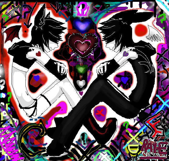
Now onto the picture it self: All the colors you've added catches a person's attention. One can get an impression that you had fun working on this, with the various patterns and lines you've used. The two characters in the center stand out because of their contrasting color scheme in comparison to the background. They're almost completely symmetrical, which adds more to the appeal of their characters. At least, in my opinion.
Hn. This comment became too long. I'll just cut it short. Good job.
xWickedx on November 11, 2007, 10:06:06 AM
xWickedx on
NightmareRave on November 10, 2007, 1:32:37 PM
xWickedx on November 11, 2007, 10:05:10 AM
xWickedx on
highteckdudu on November 10, 2007, 2:04:01 PM
highteckdudu on
