Username   Password  
Remember   Register   |   Forgot your password?

FLASH

FLASH

FLASH by ODIN7199
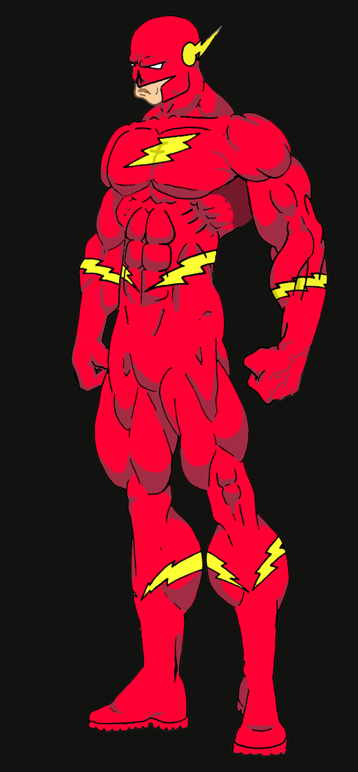
FLASH by ODIN7199

Description

Description
ODIN7199
MY FIRST ATTEMPT AT ADOBE PHOTO SHOP. I CHOSE THE FLASH BECAUSE HE HAS A FAIRLY SIMPLY COSTUME. I KNOW IT ISN'T GREAT BUT AGAIN IT'S MY FIRST TRY WITH ADOBE. LET ME KNOW WHAT YOU THINK.

General Info

General Info
Ratings
None

Category Comics » - DC Comics
Date Submitted
Views 1329
Favorites... 0
Vote Score 1
Comments 5
Media Other drawing
Time Taken 20-30 MINUTES
Reference MY MEMORY
Tags

Comments

Comments (5)

You are not authorized to comment here. Your must be registered and logged in to comment

357 on March 16, 2008, 5:38:22 AM

357 on
357Pretty nice and clean looking, I´m not a fan of anatomy like that though... :D

ODIN7199 on March 17, 2008, 1:11:14 AM

ODIN7199 on
ODIN7199ANATOMY LIKE WHAT?

357 on March 17, 2008, 6:46:41 AM

357 on
357You don´t need to use caps all the time by the way... With the anatomy I mean the style in it, bit over the top you know, for example the calfs. ^_^

ODIN7199 on March 17, 2008, 8:27:53 AM

ODIN7199 on
ODIN7199Sorry about the caps, I just type in caps at work and don't really think of taking it off. Just so you know, I am not yelling at you. But the legs are done in such a manner because the character is the flash. Hyper metabolism super strong legs, so the over exageration of the legs are needed. If you have ever seen real life sprinters, olympic level sprinters their legs are much larger than normal. Plus superheros in general are to be exagerated. Small heads big frames. Even japanimation is like this. Thank you for your comments.

357 on March 18, 2008, 1:32:07 AM

357 on
357Okay. ^_^ And yeah, I know it´s part of the style, and the pic is nice, it´s just not for me. :D