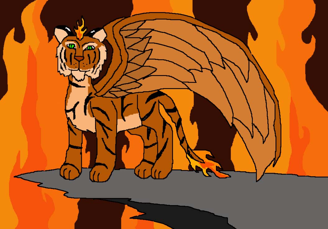
Lanaris
Lanaris
Lanaris by Phantomdragoness

Description
Description
General Info
General Info
Comments
3
Media Unspecified
Time Taken
Reference
Media Unspecified
Time Taken
Reference
Comments
You are not authorized to comment here. Your must be registered and logged in to comment
dragon45 on January 24, 2006, 9:50:08 AM
dragon45 on
ouija-phantom-wolf on October 4, 2005, 6:46:23 AM
Astronamymage on September 30, 2005, 2:05:02 PM
The shape of the face is well
Fire on the tail and the forehead is an awesome effect. You got the two tone of the tiger correct. I like the style of wings. I like your cliff; it is simple and looks great.
Bad:neck is a bit small for a tiger. the top of the back legs should be a little thicker. The front feet should be closer together than the back legs when a tiger is standing. The second wing should be more to the left and angled differently. The way you drew it, it looks like it is bent next to the other one which should be physically impossible.
Advice: If you need to create a realistic coat stripe of spot pattern, look at a picture of the animal in question. Keep the angle of the wings in mind. Yours should go more to the left and show the back of the tiger's right wing flowing behind the tiger's head and to the other side of the tiger to nearly touch the ground.
I hope that was a helpful critique. I really like this drawing. You should add a short story/background for him in the picture's description.
