untiteled pic
untiteled pic
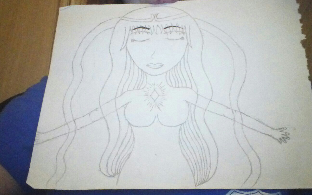
untiteled pic by Rangiku
Description
Description
General Info
General Info
Ratings
Category Anime/Manga » - Original art » Characters (Female)
Date Submitted
Views 413
Favorites... 0
Vote Score 1
Category Anime/Manga » - Original art » Characters (Female)
Date Submitted
Views 413
Favorites... 0
Vote Score 1
Comments
8
Media Graphite pencil
Time Taken
Reference
Media Graphite pencil
Time Taken
Reference
Comments
You are not authorized to comment here. Your must be registered and logged in to comment
IndyGirl on February 25, 2013, 1:20:54 PM
IndyGirl on
I like it the way it is all you have to do is color it now *faves* you rock :)
VampireWarith on February 23, 2013, 8:20:30 PM
luckylace222 on February 23, 2013, 5:32:08 PM
luckylace222 on
1. Hands are too short for her large head. Open your palsm and draw what you see to create more full/real-looking hands.
2. I really like how the eyebrows are bolded. Bold the rest of the lineart that way to make it stand out more.
3. Her breasts should be more pear-shaped.
4. The side of her ribs going do w to the waist should have a sort of curvy V shape, not a roundish shape.
5. More distinct eyelashes would bring out the eyes more. Make the eye smaller.
6. Are those tentacles coming out form her head?!
thingy on February 22, 2013, 8:05:31 PM
thingy on
kylaVegeta on February 20, 2013, 11:28:37 PM
kylaVegeta on
Hello~ Came to check it out as you said. And well I do agree with everyone so far. Where you are in your skill level this is good but can take some refinement that will come with time and everything. Such as hands and the like. Since the other's kinda pointed out what appears off. May I suggest something to help? What I do whenever I sketch is use guidlines. Do you do that? If you do then you have an amazing eraser. If you're wondering this is the guidelines I use: http://kylavegeta.deviantart.com/art/Sketch-Dump-348810163 ones on the face and I start with a stick figure to get my pose and then circles for hands and feet to help get placement. Sooo maybe with that it will help you improve on things such as proportion and facial structer. I wish you luck. You already have alot of good aspects in your drawing style, Keep up the work. I hope my advice helped you and everything. Good luck~
also I love the way the crystal looks~
darthexodus on February 17, 2013, 9:45:14 PM
darthexodus on
hmm. its eh ok. better then what i can do. i like the hair it nice and loose but classy like a princes or an Heiress(or goddess i dunno what you where going for). i also like the tiara. its elegant but simple in a good way. i also like that you gave fuller hips then alot of anime character it shows she's a women and not a little girl or a teenager.
though i do have alot of critics about this picture. one is the same with Velasgirls and Dreamfire. the hands are too small and dont look realistic, ones cut off in the pictures as well. her arms also look elongetted and it hard to tell were the elbow is on her, the left shoulder was nicely done but the right is off, making it look smaller and skinnier then the left. her breast are a little too.....how do i put this.... it feel like there no... umm they look too rounded i guess you can say. and the last thing is her eyes this is something i noticed right away. her eyes are too far away from her nose. it gives this long face look, and gives it an awkward.
those critisms(missplelled) aside this is an ok pic. not a masterpiece but then again there are rarely works that are. this too me is like one of those pics that are an early work for an artist. it might not be great but its more of a stepping stone for something greater. i hope i dont sound like an asshole.Pardon spelling a grammar error please.
Dream_Fire on February 16, 2013, 11:00:49 PM
Dream_Fire on
velagirls10 on February 16, 2013, 9:01:39 PM
velagirls10 on