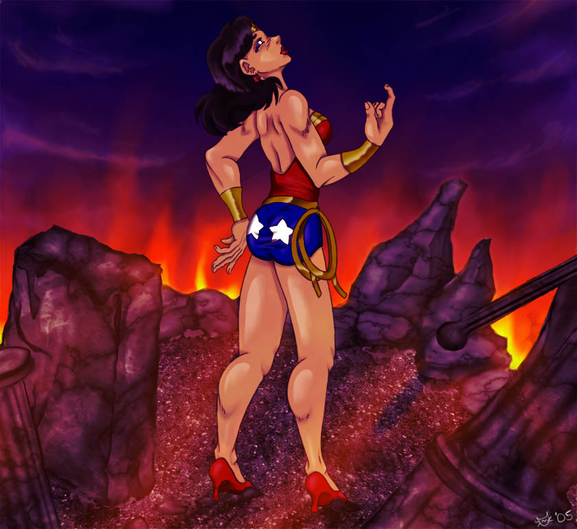
Wonder Woman kicks your butt
Wonder Woman kicks your butt
Wonder Woman kicks your butt by Reepicheep-chan

Description
Description
General Info
General Info
Ratings
Category Comics » - DC Comics » Wonder Woman
Date Submitted
Views 1983
Favorites... 0
Vote Score 0
Category Comics » - DC Comics » Wonder Woman
Date Submitted
Views 1983
Favorites... 0
Vote Score 0
Comments
5
Media Digital drawing or painting
Time Taken about 10 hours
Reference
Media Digital drawing or painting
Time Taken about 10 hours
Reference
Comments
You are not authorized to comment here. Your must be registered and logged in to comment
Gee on April 7, 2007, 4:38:46 AM
Gee on
Arachne on September 22, 2006, 8:09:53 PM
Arachne on
Running_With_Flash on April 15, 2006, 9:04:06 PM
sis on January 9, 2006, 8:37:00 AM
sis on
Maestro on January 2, 2006, 2:57:47 PM
Maestro on
However, if I'm to give you my two cents, here they are: I think her right hand (just the hand, not the arm) is a little too big - too "manly". Especially the thumb - it's a little thick and round, coming from the wrist - not quite feminine. Now, on the left hand: the fingers are more delicate, but the hand is still just a tad big, plus the thumb is on the wrong side (making it another "right" hand), although many people won't notice this unless they stop to analyze things and give thought to such detail. You're absolutely right about the lasso - needs reworking (as now it looks like a brass pretzel) and lacks the "roundness" and texture of a rope (a touch of curving cross-hatch can fix this in a sec).
Other than these minor inaccuracies, the picture has an overall stunning effect - which is the ultimate goal, right? Your coloring, once again, is superb!!!
Keep Up the MARVELous work!!! (pun very much intended) **smack myself in the face with a shovel for being a dork**
