Lynny request sketch #2
Lynny request sketch #2
Lynny request sketch #2 by Rockura-Bockura

Description
Description
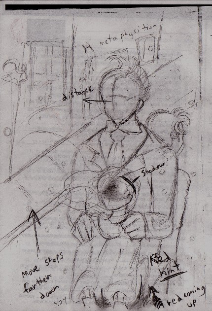
This sketch, in contrast to #1, would be best complimented with more realistic colors and shading. I believe, if you were to go with this idea, Tima should still be given a fairly abstract quality. I had the idea of having her face covered with a light shadow, and the bottom part of her body close to the bottom of the paper being a darker hue than the rest of her body, with a little red. Duke Red will be looking outward, not a lot of expression on his face, and Rock behind him, looking the other way.<br />
<br />
I'm sorry, the positioning in this sketch is downright ugly. The eye travels over to the shops, and I don't want that. I want it to move in a circle, starting at the Duke, to Rock, and then down to Tima. The shops are too close in this sketch. If you do decide to go with this idea, I'll move the shops back a bit and put the characters closer to the front. I don't want to put them exactly in the middle.<br />
<br />
Sorry for how rough it came out. E-mail me if you like this idea, and tell me how you'd like me to alter it. Was it close to the idea you had?
<br />
I'm sorry, the positioning in this sketch is downright ugly. The eye travels over to the shops, and I don't want that. I want it to move in a circle, starting at the Duke, to Rock, and then down to Tima. The shops are too close in this sketch. If you do decide to go with this idea, I'll move the shops back a bit and put the characters closer to the front. I don't want to put them exactly in the middle.<br />
<br />
Sorry for how rough it came out. E-mail me if you like this idea, and tell me how you'd like me to alter it. Was it close to the idea you had?
General Info
General Info
Comments
0
Media Unspecified
Time Taken
Reference
Media Unspecified
Time Taken
Reference
Comments
You are not authorized to comment here. Your must be registered and logged in to comment
