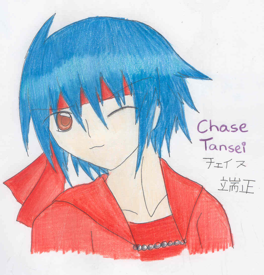
Lost Memory~Chase again x3;;
Lost Memory~Chase again x3;;
Lost Memory~Chase again x3;; by Saru_no_Cheesecake

Description
Description
Can't get over drawing him with his short hair *laughs* It's so fun! x3 I still liked him with long hair better though. Just my opinion.
Also, a note here, his first name is in katakana because, well, 'Chase' isn't exactly Japanese *laughs*, but his last name is (for some weird reason...don't ask me. Just because I'm the creator doesn't mean I know XD) Fun fact: The kanji for his last name 'Tansei' means 'Handsome' or 'Noble' *giggles* That's my Chase! ^_^
Comments and faves are appreciated! ^_^
(and yes, my Jap writing sucks x3)
This is MY character from MY story Lost Memory! SO DON'T STEAL HIM OR ELSE!!! Here's my little trademark thing: TM! TM! TM! TM! TM!!! I think you got my point? ^^
General Info
General Info
Ratings
Category Anime/Manga » - Original art » Characters (Male)
Date Submitted
Views 1327
Favorites... 1
Vote Score 2
Category Anime/Manga » - Original art » Characters (Male)
Date Submitted
Views 1327
Favorites... 1
Vote Score 2
Comments
7
Media Colored Pencil / Crayon
Time Taken
Reference
Media Colored Pencil / Crayon
Time Taken
Reference
Comments
You are not authorized to comment here. Your must be registered and logged in to comment
princezuko101 on December 21, 2007, 9:12:55 AM
rlkitten on November 23, 2007, 4:38:06 AM
rlkitten on
Trinity_Fire on November 20, 2007, 9:58:57 AM
Trinity_Fire on
Well, I think a really nice point here is that you are already pretty well-versed in colored pencils, and your shading is really quite smooth. (I'm a little jealous of it, really...)
But I think the big principle here is, try to use more than one color when shading something, anything, whatever it is! (Sorry; here goes the long comment~!)
There's gotta be a color for the base, but really, don't let that stop you! If you examine things in real life, yeah, manufactured products are generally one color, but natural things (a person's hair, skin, eyes, etc) are all much, much more than one color. When you color in your picture with just one colored pencil, it makes the image look bland and flat. And even on single-color objects, like, oh, I dunno, your computer, or mouse, or whatever, objects still carry a wide range of shades for its shadows and highlights.
Let's start from the top and move down, okay? Your character has a really interesting shade of blue hair... I like it! And the highlights are interesting... mind my asking, how did you do those?
If you want highlights to be brighter or more noticeable, try using your eraser! A pencil eraser (the white kinds on mechanical pencils; I'm not sure how well the red ones on wooden pencils work) or a clik-eraser would be best for smaller erasures; you'd be surprised how well erasers work on colored pencils. A highlight across the hair would be nice... Have you seen that recent pic of mine, "luke smile?" Sorry to be referencing myself, haha, but that's how I did the final highlight across his head. Also, leaving the area blank when I color over it initially makes it easier, but it's hard for some people to pre-pick out the locations of the highlights, so it's all up to you.
Anyway, if you were thinking about different shades... don't be afraid to go radically different in the colors! For this blue, you could add plenty of other colors! Purple, I think, would work really well for shading it... And hair is an interesting thing to shade. Try to work in streaks and lines, rather than bulky chunks as some anime do. To make it more realistic, the slimmer the lines, the better. (To a certain extent.)
And... who knows? Maybe a touch of green or a different shade of blue for the highlights. :) Blue's a color I haven't worked with too much, so I don't know.
Now, next up, take his skin. It's... colored really, really lightly from whatever my computer monitor or your scanner registers. For skin, don't be afraid to press down! Really; compared to the darkness of his hair and outfit, the skin is much, much too pale and distracts from the picture's otherwise well-rounded color balance. Don't be afraid to add in shades; and remember, skin is far from just peach. I just use peach as a base, and a little lightly, as I'm not too fond of it. I usually overlay the skin of the characters I draw with light gray, goldenrod (dull yellow), and even some light brown and terra cotta (reddish brown). This is much more natural, as peoples' skin varies, and a mishmash will turn out better than you think; just layer them lightly one over the other, and don't be too shy. :) Test things out! The eraser comes in handy for anything you really don't want to keep. And remember, try to show shadows and highlights! Highlights are kinda tough on skin, but shadows are a must. Even anime faces can't be all-flat.
Finally, the red. His jacket is nice, but again, there's really not much variation in the shades, and using the same red for his jacket, headband, and undershirt makes the viewer a little bored of the color and skim over the details. Even if you pressed hard on one and not the other.
Try different reds! If you don't have different reds, then overlay the one detail/section with a yellow, an orange, something like that. A light brown is nice. Also, brown is a nice 'shadow' color for red, so try that out. Clothing texture is kinda tough, but it's generally just a really smooth shadow, gradient-like, really. I'm not too savvy with those, so I've not too many hints to give. You can also go over clothes in less layers so it maintains a bit of a 'grainy' feeling, then smooth over the whole thing with white for a completely different effect; it smoothens over the grains but leaves some white, which might be a little more like clothing textures; again, just an approach I use sometimes.
Phew! Anyway, those are just a few starter tips. Intimidated? I hope not. Just don't be afraid to step out and try new things, okay? You've got all these colors; don't restrict yourself to so few basic shades! Explore!
I think you'll do fine. Your picture and lineart are excellent; here are just a few tiny pushes in the right direction, or so I hope. :)
rlkitten on November 23, 2007, 4:37:44 AM
rlkitten on
KingdomHeartShera on November 20, 2007, 10:14:10 PM
I know Trinity-san's comments are long, but she helped me improve big-time. ^^ So both of you are uber-awesome. <333
Suneku on November 20, 2007, 5:04:34 PM
Suneku on
Playstationfreak on November 20, 2007, 4:36:01 PM
I like his short hair much better, yupyup -nods-
Anyway, he looks really cute here, and I like what you've done with the colours.
Wow, my comment feels really, really short compared to the one bellow xDD when I saw it I was like; O.o woah.
