Lord of Death
Lord of Death
Lord of Death by ShadowSharingan
Description
Description
General Info
General Info
Ratings
Category Anime/Manga » - Original art » Anime Fantasy
Date Submitted
Views 1137
Favorites... 1
Vote Score 0
Category Anime/Manga » - Original art » Anime Fantasy
Date Submitted
Views 1137
Favorites... 1
Vote Score 0
Comments
6
Media Unspecified
Time Taken
Reference
Media Unspecified
Time Taken
Reference
Comments
You are not authorized to comment here. Your must be registered and logged in to comment
Chibi_Sorceress on June 16, 2006, 7:22:37 AM
OMG!Awesome!Great pic ShadowSharingan!
ShadowSharingan on June 16, 2006, 6:20:43 AM
MaoHiwatari on June 16, 2006, 6:14:54 AM
MaoHiwatari on
cookiemonster on June 15, 2006, 10:26:09 AM
ShadowSharingan on May 27, 2006, 7:53:43 AM
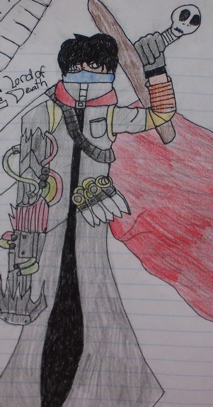
About the do'nt draw on lined paper thing i have to say i would if i could its not that i dont have any lineless paper around its just that when i try to draw without lines my pic turrn out realllllllllly bad. Your right about his sword, last of all see that blue mask on his head his mouth is under that, his eyes are right above that, squigley lines where his left eye should be was supposed to be a mechanical eye but it didnt turn out good. Last last of all i just recently read your profile and i very much approve of everything in it.Last last last of all iv got two words for ya " Hand cramps"
Master_Chief60 on May 10, 2006, 8:56:14 AM
He looks pretty cool. I suggest drawing on paper like printing paper or sketch paper though. Its such a waste drawing on lined paper when your image is that good.
Here's a few suggestions, however.
His sword needs to have more paralell lines on it, and the hilt needs to be a tad more decorated. I like the skull on the end but it needs to be a tad more strait.
His head also is in a strange shape. I can't tell where his eye is or his mouth or any of the sort. But other then that, the pic is pretty cool and I think you did a good job.
*favs*