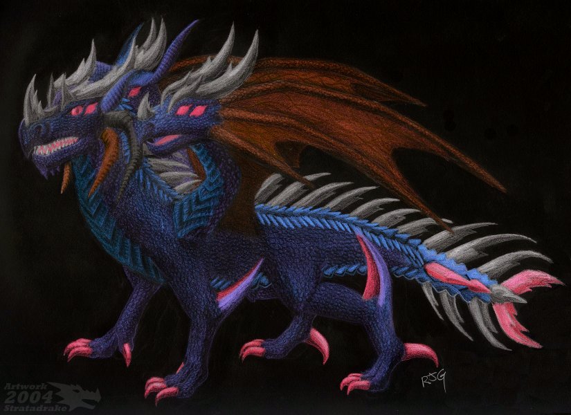
Dragon of Elements - Darkness
Dragon of Elements - Darkness
Dragon of Elements - Darkness by Stratadrake

Description
Description
Entering the seventh and penultimate spot on my list of elemental dragons is Darkness, in his third and final incarnation. I decided to utilize the 'hand-drawn negative' technique for shading this dragon. For those who don't know what this technique is, you simply shade a drawing in reverse and invert it on computer after scanning (see my dA Scraps for details). Executed well, the results can be quite dazzling, and much like when I completed my Kitty Ninja months ago, I was amazed speechless when I finished the inversion and beheld the final result.
So, anyway, what is Darkness? Nobody's quite sure. Is it matter? Energy? Something else entirely? Darkness is an element shrouded in mystery and confusion -- and no, it's not an element of "death". It's known that darkness had to play some role in creation, but exactly what, no one knows.
As it is, Darkness also carries the unfortunate distinction of being Evil. No one knows how or why it is, but history attests that this is true. Because of this, Darkness is called a weakened element, one whose time is limited and whose days are numbered. In spite of -- no, because of this, Darkness has developed something of a hostile inferiority complex -- always the brute, using strength and illusion to mask its inner failure and weakness.
Henceforth, while Darkness certainly appears to have three heads and twelve eyes, those are merely illusion designed to incite fear upon its enemies. Look closely and you may identify the two extra heads for what they really are.
The next, the last, and most certainly not the least of the elements in this series is going to be Light, and I have something special planned for him.
Medium: Colored and ebony pencil, inverted (for more information, see my dA Scraps, here)
Time: About 5 hours
Scale (full view) 75px/in
General Info
General Info
Ratings
Category Fantasy » Dragons » Elemental Dragons
Date Submitted
Views 3600
Favorites... 31
Vote Score 3
Category Fantasy » Dragons » Elemental Dragons
Date Submitted
Views 3600
Favorites... 31
Vote Score 3
Comments
19
Media Colored Pencil / Crayon
Time Taken 5 hours
Reference
Media Colored Pencil / Crayon
Time Taken 5 hours
Reference
Comments
You are not authorized to comment here. Your must be registered and logged in to comment
elyo11 on July 26, 2007, 2:32:22 AM
elyo11 on
Stratadrake on July 26, 2007, 10:17:55 PM
Stratadrake on
UnderUnion on July 22, 2007, 12:02:53 PM
UnderUnion on
KionaKina on June 14, 2007, 2:07:07 AM
KionaKina on
NeoTheDragon on September 23, 2006, 2:55:27 AM
NeoTheDragon on
Stratadrake on September 24, 2006, 3:28:20 AM
Stratadrake on
ZidanesGirl on July 22, 2006, 8:53:20 AM
ZidanesGirl on
Moonlightelf on February 2, 2006, 2:51:45 AM
Moonlightelf on
DarkBaralai on January 6, 2006, 1:34:21 PM
DarkBaralai on
Fairygurl27 on August 24, 2005, 3:42:40 PM
Fairygurl27 on
DRKPR0PH3T on July 7, 2005, 7:08:21 AM
DRKPR0PH3T on
AngelKite on May 4, 2005, 5:39:55 PM
AngelKite on
AngelKite on May 4, 2005, 5:39:17 PM
AngelKite on
Anyway,you said you already used blue for the twilight dragon.I meant that the colour of the twilight dragon should be mostly blue,but with a sort of light,glittering effect.
Overall,I think it's awesome,the colouring is fantastic as always and I am wanting to say 'I luv it *faves*' but I shan't.
But,*faves* anyway.
Heatherenie on May 2, 2005, 12:10:32 PM
Heatherenie on
Queen_Asheer5600 on March 30, 2005, 12:08:48 PM
On a basic Hydra the heads usually all connect into the chest, side by side. Or at least that is the way the legends predicted them. With the exterior heads being placed over the shoulders, to me it looks like this guy might have a little... bit of a complex walking problem. I can see that the 'heads' are accually ment to be a sort of 'wing' type structure. Wouldn't that sort of crack the neck of the animal when it flies (at least on the exterior heads) unless he isn't truely ment for flight.
But I still love the image all together, this is nicely done as always.
espiotheanimedragon on March 21, 2005, 10:08:36 AM
Queen_Asheer5600 on January 8, 2005, 2:04:20 AM
KFelidae on January 2, 2005, 11:22:33 AM
KFelidae on
So, is the "head" part of the palm and the "lower jaw" the thumb? Or does it have some different anatomy entirely?
And your inversion worked extremely well on the scales, as they look so much more defined than in previous pics. Very nice, Strata!
