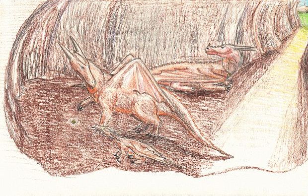
Dragon and Child II (2000)
Dragon and Child II (2000)
Dragon and Child II (2000) by Stratadrake

Description
Description
Sometime in Spring, 2000, I broke out my colored pencils for the "last" time (because I still haven't put them away since then) and made a complete re-draw of my first dragon picture ("Dragon and Child 1999"). A new sheet of paper, a new sketch, new colors, but the same subjects, the same backstory. This time the scenery is more to scale, and the father sits in the background. Already visible are various decisions I started making in the physiology department, such as thicker wings and limbs, and a thinner/sleeker midriff.
This was also one of the few times I actually tried drawing and coloring a full scene rather than simple/abstract scenes or straight character drawings.
Medium: Colored & 0.7mm pencil
Time: About two hours
Scale: 72px/in
This was also one of the few times I actually tried drawing and coloring a full scene rather than simple/abstract scenes or straight character drawings.
Medium: Colored & 0.7mm pencil
Time: About two hours
Scale: 72px/in
General Info
General Info
Ratings
Category Fantasy » Dragons » Elemental Dragons » Fire Dragons
Date Submitted
Views 2835
Favorites... 11
Vote Score 0
Category Fantasy » Dragons » Elemental Dragons » Fire Dragons
Date Submitted
Views 2835
Favorites... 11
Vote Score 0
Comments
4
Media Unspecified
Time Taken
Reference
Media Unspecified
Time Taken
Reference
Comments
You are not authorized to comment here. Your must be registered and logged in to comment
Pride_of_lion on February 24, 2006, 5:05:02 PM
Choco_Chick_87 on March 7, 2005, 7:27:19 AM
cry_dark_raven on July 5, 2004, 1:04:33 PM
Boos_girl on May 18, 2004, 10:40:40 AM
Boos_girl on
