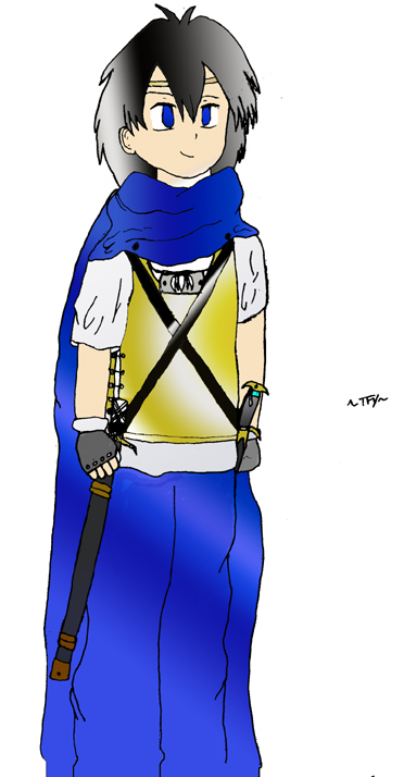
Masaru (Colored)
Masaru (Colored)
Masaru (Colored) by TheFoxYoukai

Description
Description
General Info
General Info
Ratings
Category Comics » - Original Comics » - Characters & Fanart
Date Submitted
Views 1373
Favorites... 0
Vote Score 0
Category Comics » - Original Comics » - Characters & Fanart
Date Submitted
Views 1373
Favorites... 0
Vote Score 0
Comments
6
Media Unspecified
Time Taken
Reference
Media Unspecified
Time Taken
Reference
Comments
You are not authorized to comment here. Your must be registered and logged in to comment
vixenrath on December 8, 2004, 2:38:48 PM
vixenrath on
CatboyKenji on May 28, 2004, 10:59:38 PM
CatboyKenji on
Ryukushen on May 21, 2004, 8:55:40 PM
Ryukushen on
I know what you could do to fix it! You should have called it Masaru the Action Figure!!! And you could have the swords come out, and you can stick it in his hands then press the button on the back for chopping action!!! The colors are good but there is no depth in them making him look flat. You should manually shade him instead of doing the light thingy next time. But it's still good like the colorless one.
DarkUnicorn on May 15, 2004, 1:36:22 PM
DarkUnicorn on
