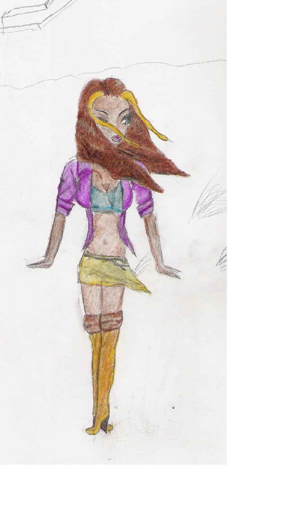
1Karen
1Karen
1Karen by VineyardGuy99

Description
Description
I looked at the online one and the original and realized that it was streached out of porportion, probably because i used ms-paint to slim it down I will have a fixed one on here titled
"1Karen better"
I decided to try and make some of the HM girls look realistic all I have gotten to so far is Karen.
No, it is not finished only because I don't know what exactly to do for a background so if anyone could give me ideas it would be strongly appreciated.
P.S.
When I scanned it, the picture obvioulsly got very pixalted so when you open it to see it larger it looks a bit messier than it really is.
General Info
General Info
Ratings
Category Games » - All Titles » Harvest Moon
Date Submitted
Views 2761
Favorites... -1
Vote Score 0
Category Games » - All Titles » Harvest Moon
Date Submitted
Views 2761
Favorites... -1
Vote Score 0
Comments
7
Media Unspecified
Time Taken
Reference
Media Unspecified
Time Taken
Reference
Comments
You are not authorized to comment here. Your must be registered and logged in to comment
Summersong on November 25, 2005, 12:47:39 PM
Summersong on
VineyardGuy99 on August 8, 2005, 2:03:36 PM
VineyardGuy99 on August 8, 2005, 1:53:28 PM
GogoKitty on August 8, 2005, 11:19:50 AM
GogoKitty on
The hips should be wider and so should the midriff so that they'll balance out the boobs a little better (think hourglass).
The legs are really short when compared to the rest of the body so you might want to try making those longer on whatever person you draw next. The feet are also small so you may want to make those bigger too.
I kind of have the same problem sometimes. I'll draw things way too small for the rest of the body and then it looks odd.
Someone told me to just remember not to be afraid of spreading things out more and making sure they're big enough. That has helped me. :)
dragons_healing_blood on July 23, 2005, 12:59:21 PM
VineyardGuy99 on July 22, 2005, 4:39:18 AM
dead_artist on July 21, 2005, 4:09:03 PM
dead_artist on
