Dragon
Dragon
Dragon by Weirdopunkwolf

Description
Description
General Info
General Info
Comments
15
Media Unspecified
Time Taken
Reference
Media Unspecified
Time Taken
Reference
Comments
You are not authorized to comment here. Your must be registered and logged in to comment
Clueless on April 11, 2005, 1:19:45 PM
Clueless on
AZNgummigurl on April 11, 2005, 12:25:04 PM
AZNgummigurl on
legato_sama on January 29, 2005, 8:48:17 AM
legato_sama on
SPAWNOFTHEFLAMES on January 14, 2005, 3:38:32 AM
Templado on November 5, 2004, 6:32:03 AM
Templado on
Moon_Bind on October 10, 2004, 12:01:28 AM
Moon_Bind on
DreamOfFire on September 27, 2004, 2:56:41 PM
DreamOfFire on
frodobursh on August 31, 2004, 4:17:40 AM
frodobursh on
RadioactiveDragon on August 20, 2004, 2:20:40 PM
Cons-erm...I have a poster of this EXACT same dragon on me wall*points to wall* o.o; next time try doing a completely origional dragon ^-^; (sorry,it's a bit of a pet-peeve of mine when people dont 'produce' work that is their own.u_u)<br />
Anywho,it's still very well done.I like the use of detail..*isnt good at adding details to things*
Weirdopunkwolf on August 12, 2004, 3:51:08 PM
0ash0 on July 29, 2004, 9:05:42 AM
0ash0 on
Stratadrake on July 28, 2004, 7:33:37 PM
Stratadrake on
<br />
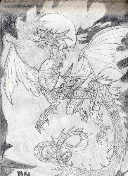
Best batten down the hatches and prepare for some serious commentary. This dragon's far from bad, although I do notice a few things that don't work for me. It looks like you skimped a bit on the texturing for the dragon's rear legs, compared to the excellent job you did everywhere else on the dragon's scales (particularly the neck). And the dragon's tail strikes me as too long (a personal preference of mine, don't let that bother ya). When you draw a long tail, try to keep it tapering from thick to thin equally. Near the end of the dragon's tail, after it loops to the right and then to the left again, the tail actually gets <i>thicker</i> for a moment before proceeding to taper down to its tip -- that's something to work on.<br />
<br />
I see the dragon's wings are held at different (non-symmetric) angles, the right (far) one being angled much more forwards than the left (front) one; but that's okay considering the angle of the pic.<br />
<br />
Also, that little frill (or "collar"?) around the dragon's neck looks a little odd, as if the dragon was molting when you drew it. Do your dragons shed their scales or something? No need to answer, just some random speculation on my part. (I do that)<br />
<br />
Overall I think my favorite part about this pic is the dragon's head, probably because it looks more detailed than, say, the hindquarters. And another cool thing, the shadow on the upper-right looks like a dragon's head, though it can't be the same one since the shadow has a large nose horn and the dragon doesn't.<br />
<br />
So, all in all, the drawing ain't bad. It has a few little snags here and there, as if you kinda ran out of patience/steam while drawing in all the scales. I've seen dragons I like better, but that's okay, because I guess my preferences are just weird. <img src="http://www.fanart-central.net/forums/html/emoticons/happy.gif" />
Evyl on July 28, 2004, 8:49:47 AM
Evyl on
silvermay on July 28, 2004, 7:20:44 AM
silvermay on
Spectre on July 28, 2004, 7:02:32 AM
Spectre on
