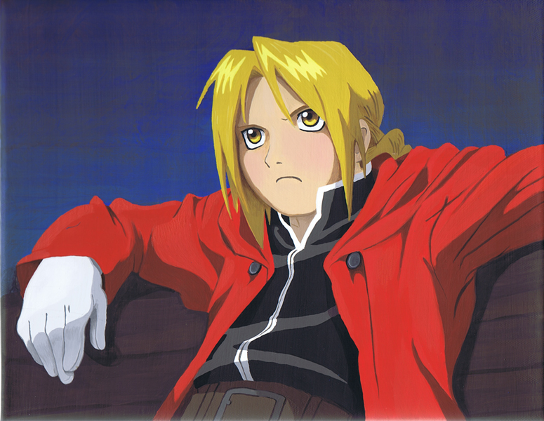
Edward Elric on Bench
Edward Elric on Bench
Edward Elric on Bench by ablevins

Description
Description
General Info
General Info
Ratings
Category Anime/Manga » Fullmetal Alchemist » - The Elrics » Edward
Date Submitted
Views 2230
Favorites... 16
Vote Score 9
Category Anime/Manga » Fullmetal Alchemist » - The Elrics » Edward
Date Submitted
Views 2230
Favorites... 16
Vote Score 9
Comments
13
Media Acrylics
Time Taken
Reference Pic from a magazine
Media Acrylics
Time Taken
Reference Pic from a magazine
Comments
You are not authorized to comment here. Your must be registered and logged in to comment
Baronsgirl on April 15, 2010, 4:41:01 AM
Baronsgirl on
MomoRyu on February 26, 2010, 2:54:01 AM
MomoRyu on
luckylace222 on September 7, 2009, 10:16:06 AM
luckylace222 on
Devon11 on April 21, 2009, 10:57:30 AM
Devon11 on
chewymonstahh027 on April 17, 2009, 9:10:48 PM
SweetxinsanityxSarah on April 17, 2009, 11:03:25 AM
WannabeArtist on February 17, 2009, 2:26:01 AM
Asj on February 12, 2009, 11:56:39 AM
Asj on
It's so hard using paint! One of the first times I tried painting something, I realized how hard it is to get the correct colors, and even recently, years later, it's hard to get the lines right, since brushes tend to want to mess up everything.
ablevins on February 13, 2009, 8:31:05 AM
ablevins on
BadArtist on November 24, 2008, 11:36:20 PM
BadArtist on
kaitlin_mckitrick on November 24, 2008, 4:17:38 AM
Gehe on November 22, 2008, 3:41:02 PM
Gehe on
But you could have prepeared the Surface that you pain better so there wouldnt be eny "up&down" lines.
You can stil spot some minor "mistakes" in you brush using. but they are really small... Ex: That small spike ok hair at the left side of Edward, and the zipper is bit overzide at the end of hes shirt.
But overall amazing work. keep practicing. and painting. you are REALLY good at it.
Keiyou on November 22, 2008, 12:21:48 PM
Keiyou on
