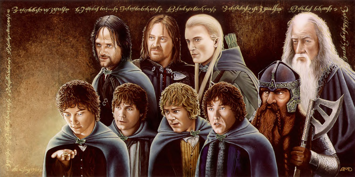
The Fellowship
The Fellowship
The Fellowship by cinemalad

Description
Description
General Info
General Info
Comments
12
Media Oils
Time Taken Roughly 400 hours!
Reference Still photos
Media Oils
Time Taken Roughly 400 hours!
Reference Still photos
Comments
You are not authorized to comment here. Your must be registered and logged in to comment
writingraven on January 17, 2009, 7:49:12 AM
writingraven on
4charliepace4 on February 24, 2008, 6:59:45 AM
KamulTheNazgul on November 27, 2006, 3:26:12 AM
Ralinde on November 9, 2006, 7:00:22 AM
Ralinde on
CaptiainIndianaSolo on September 30, 2006, 8:05:18 AM
Stratadrake on September 27, 2006, 1:12:32 PM
Stratadrake on
For starters, the good points: Love that coloring and blending of the paints. It is smooth and shows that a lot of patience and work went into the piece. The details on Gimli's helmet and axe are solid enough you can almost literally "feel" the metal.
And then . . . the not-so-good. Minor flaws. The highlights on the hobbits' hair sorta distracts me, because edge-highlighs like that imply backlighting, which seems a little out of place considering that the hobbits are in the front row. And while your realistic shading is very commendable, realism is a notoriously unforgiving target; this one sits on the edge of the Uncanny Valley where it looks right, but doesn't quite feel right. Boromir and Merry look fine, for example, but I'm not so sure about the other Fellowship members. I notice Gandalf's nose seems to be a little on the large side (though not to the extent of a Cyrano de Bergerac ;)) , and Aragorn's eyes seem a little too twinkly for me (I never considered Aragorn to be the "bright eyes" type). The faces feel 'off' in the slightest way, and when a character's face doesn't look right, it bogs down the piece as a whole, more so than it honestly should.
Those are really minor flaws. You nailed the blending and shading overall, it's the subtleties that slightly demerit the overall experience. And subtleties aren't something that one can just look at and point out how to easily fix them (I find from they are often defined during the conceptual phase, before applying any shading or blending of actual colors onto the surface); they're like the Matrix in that you can't be told what they are, you have to see it for yourself. For lack of a better term, it's sort of a "zen" thing.
So, wrapping this up -- great blending, good perseverance to work through a large-sized painting, only a minor stumble here and there to watch out for. It's good work, so keep up the studies on how to master the subtle points.
SasuSaku01 on September 27, 2006, 9:43:12 AM
SasuSaku01 on
Daennika on September 26, 2006, 11:08:48 PM
Daennika on
saturn13 on September 26, 2006, 4:18:02 PM
saturn13 on
BadArtist on September 26, 2006, 2:28:42 PM
BadArtist on

*faints*
faves!