Username   Password  
Remember   Register   |   Forgot your password?

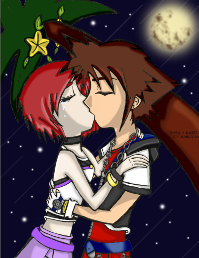
+ Kairi et Sora +

+ Kairi et Sora +

+ Kairi et Sora + by divineoblivion

Description

Description
divineoblivion
The tree looks shiny. oO; And the wood carvings of their names and mine look cheesy. -_-; Oh, and the moon looks like it got ran over. And both of the two look too skinny. And Kairi is too pale. And my attempt of the shooting stars are dumb. And the hands are too small. And the.. - insert flaws here -

General Info

General Info
Ratings
None

Category Games » - by Publisher » Square-Enix » Kingdom Hearts series » Characters (KH1)
Date Submitted
Views 7135
Favorites... 7
Vote Score 0
Comments 13
Media Unspecified
Time Taken
Reference
Tags

Comments

Comments (13)

You are not authorized to comment here. Your must be registered and logged in to comment

MaxLightning1 on June 19, 2006, 12:14:26 AM

MaxLightning1 on
MaxLightning1awsome :)

Kamire_san on April 15, 2006, 10:41:01 AM

Kamire_san on
Kamire_sani think its pretty ok. the only thing that seems wrong is Kairi looks like shes dead (no offense) and and Sora's are coming of the shirt looks weird. Ha, that's funny, the moon got ran over :D

sili on November 30, 2005, 5:09:38 AM

sili on
siliNo offence or anything but Kairi's really pale.

Kupo on November 2, 2005, 10:40:18 AM

Kupo on
Kupooh yeah and i forgot to say, the shading rocks and the pose is good! ^-^

Kupo on November 2, 2005, 10:38:48 AM

Kupo on
Kupowell i guess you've already named all the flaws so all there's left to say is the good stuff! the poupu fruit looks cute, kairi really should be significantly paler than sora like you drew her, the moon actually looks awesome,their hair is really good(ihave so much trouble w/ both of their hair! esp kairis!), and i love how the colors are so bright w/o that even makin them look slightly out of place in those dark surroundings

Dark_Phoenix on February 22, 2005, 10:40:01 PM

Dark_Phoenix on
Dark_Phoenixweeeell, personally I have never drawn a kissing picture but what helpful criticism I can give is this. When a couple is kissing, one of them has to have their heads tilted. For Kairi the bottom half of her head looks semi-tilted but not so much the top. My suggestion is to find a picture where someones face position is the same so you can reference off that.

Linklover91 on February 22, 2005, 10:11:35 PM

Linklover91 on
Linklover91this is cool! i think you did sora and kairi pretty good! why would kairi be crying? i would be sooo friggin happy if that happened to me

Krystal on August 22, 2004, 1:57:23 PM

Krystal on
Krystalwhat r u talkin about? i think the pic is cute lol!

KagomeTheArcher on August 2, 2004, 4:21:36 AM

KagomeTheArcher on
KagomeTheArcherKawaii!!! I love this couple!!! Sora and Kairi forever!!!!!!!

DarkSilicon on July 18, 2004, 7:38:06 AM

DarkSilicon on
DarkSiliconI did a similar pic, except this is like the sequel (sp?) because there's actually some action in it XD I think it's rather cute, your coloring is awesome and the moon and shooting stars are nice. Good job.

divineoblivion on July 18, 2004, 6:27:25 AM

divineoblivion on
divineoblivionYup, I messed up a whole lot on this pic. Lol, but thank you for telling me what I did wrong, so I can ' improve ' And yeah, I kinda noticed that Sora's arm was a little out of proportion when I started drawing his arm. x_x;

Akito on July 18, 2004, 6:23:42 AM

Akito on
AkitoSorry kid, but you did kinda screw up a lot on this picture, don't get me wrong, I kinda like it! But the porportions of everything is off, but I used to suck at drawing too, I gotta get my new stuff up! Anywho...<br />
<br />
Kairi's back side is like all ... flat, it would have some sort of curve, Sora's arm coming out of the shirt doesn't match with his shoulder, they're hands are really small, also a lil' short. But besides those, it's good!

Sennia91 on July 18, 2004, 6:09:34 AM

Sennia91 on

Sennia91why point out all of the "flaws" this is really good! i wish i could cg like that! your sora and kairi look original, you don't want them to look <i>just</i> like square's drawings! im putting this on my faves