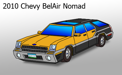
Chevrolet BelAir Nomad Concept
Chevrolet BelAir Nomad Concept
Chevrolet BelAir Nomad Concept by infurno

Description
Description
General Info
General Info
Ratings
Category Miscellaneous » Science & Technology » Vehicles/Automotive » General Motors
Date Submitted
Views 995
Favorites... 0
Vote Score 0
Category Miscellaneous » Science & Technology » Vehicles/Automotive » General Motors
Date Submitted
Views 995
Favorites... 0
Vote Score 0
Comments
5
Media Digital drawing or painting
Time Taken
Reference
Media Digital drawing or painting
Time Taken
Reference
Comments
You are not authorized to comment here. Your must be registered and logged in to comment
357 on May 6, 2006, 10:19:49 PM
357 on
Deathelf on April 23, 2006, 3:09:38 AM
Deathelf on
jira on April 14, 2006, 1:41:47 PM
jira on
zakuman on April 14, 2006, 6:15:15 AM
zakuman on
Now some aspects of this do look better then a magnum. But it's a very tough car to design. Cause essentially it's a station wagon beefed up. And I'm thinking I'd want the late 50's one, versus your retro styling. But the crome work and that grill are sweet. I'd like to see the housing around those light be a little more curved though. I think with a little tweak of the lights, this would be something. Sad to just say that. But lights are an extremely important factor in design.... to me anyway.
But keep up the work on these concepts, they are nifty. And relatively believable.
Amadeus on April 13, 2006, 2:48:25 PM
Amadeus on
