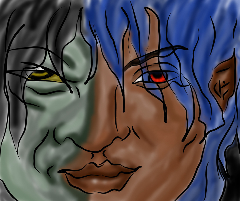
the monster within.
the monster within.
the monster within. by iyoday

Description
Description
OK if your wondering why this picture looks a little different its because
i did it all on my computer.
that's right no paper at all. completely free hand on on my computer.
but i think it still looks cool especially if you ever saw all of my other pics
that i did all on the computer only.
well please comment and enjoy.
by the way if he looks a like the hulk it was not intentional.
ohh i need to down size it.
General Info
General Info
Comments
6
Media Digital drawing or painting
Time Taken not long
Reference none
Media Digital drawing or painting
Time Taken not long
Reference none
Comments
You are not authorized to comment here. Your must be registered and logged in to comment
DocOck on January 18, 2007, 5:33:41 AM
DocOck on
DivinePathos on January 14, 2007, 7:15:04 AM
DivinePathos on
moonlightwolf10 on January 3, 2007, 10:46:17 AM
Trinity_Fire on December 25, 2006, 4:26:08 AM
Trinity_Fire on
In particular here, I actually really like the wavy lines you used. They've got a lovely variation to thickness, and the way it's used here, it gives the image a kind of warped, truly 'monstrous' feel. XD
I really, really like the lips, too. Those are some very nice lips, and the nose as well! 8O
And the different color palettes came out very nicely here, as did the two different-colored eyes and everything.
There's really not so much to say... let's see...
For one thing, when you're doing the hair, don't double back over for the other half! When drawing hair, it should be one smooth stroke after another, and the ends should taper. Hold up your hair and you'll see; it ends in a tiny, thin point, not doubled-over. Do that, and the hair will look a little bit more natural.
Another thing is, although I don't know much about CG programs myself (heh) I know photoshop has plenty of layers. Color the hair and the skin and the eyes all on separate layers, and you shouldn't have mixing problems around the edges of the face/hair.
Otherwise though, truly awesome. You're getting SO good at this!!!
Keep it up, and happy holidays~ ;)
balong on December 24, 2006, 5:05:14 AM
balong on
zelosgirl120 on December 23, 2006, 2:44:19 PM
zelosgirl120 on
