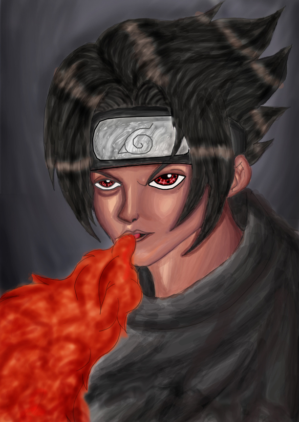
uchidha sasuke
uchidha sasuke
uchidha sasuke by iyoday

Description
Description
General Info
General Info
Ratings
Category Anime/Manga » Naruto series » Characters & Fanart » Sasuke
Date Submitted
Views 1455
Favorites... 2
Vote Score 1
Category Anime/Manga » Naruto series » Characters & Fanart » Sasuke
Date Submitted
Views 1455
Favorites... 2
Vote Score 1
Comments
6
Media Digital drawing or painting
Time Taken many hours!!!
Reference sasuke
Media Digital drawing or painting
Time Taken many hours!!!
Reference sasuke
Comments
You are not authorized to comment here. Your must be registered and logged in to comment
balong on June 21, 2008, 8:04:52 AM
balong on
Falconlobo on January 6, 2008, 12:00:10 AM
Falconlobo on
Midnight_Chaos on September 28, 2007, 12:57:29 PM
iyoday on October 3, 2007, 1:43:56 AM
iyoday on
Midnight_Chaos on October 3, 2007, 2:14:52 PM
Trinity_Fire on September 26, 2007, 6:33:50 AM
Trinity_Fire on
And the metallic effect on the headband, and the black and gray background. Very, very nice. :3
My only thing to crit on here would be the fire. It's really bright and red, but it's much, much too solid for fire. Fire is invisible half the time in dim-strong lighting, and it's hardly ever bright red. Check out some references for this; but next time, make sure the edges to a flame are all faded and blurry, because that's how fire really looks like.
Otherwise~ the piece is a little rough around the edges. You didn't clean up around the fire and Sasuke's skin colors too well; remember to use layers for this, and take your time. Art takes a long time, I'm afraid. :3
Really though, very nice pic. :3 Clear improvements.
Awesome.
