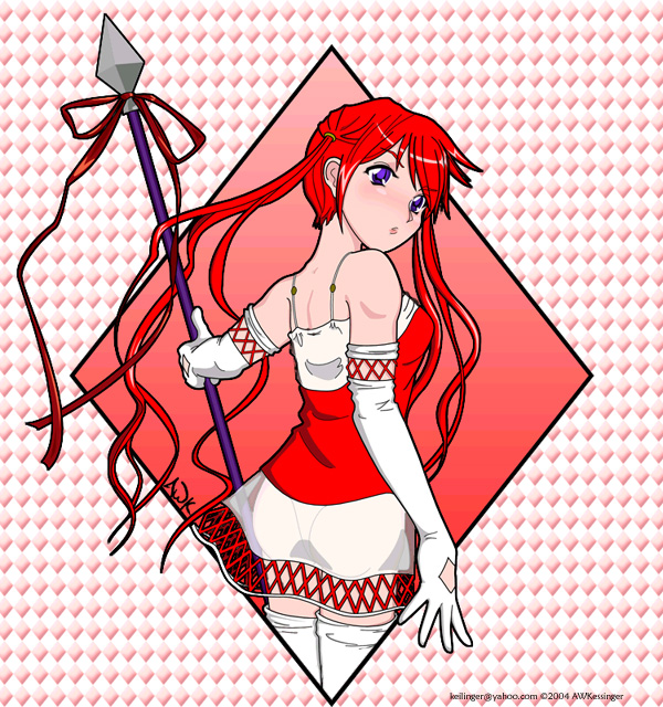
3 of Diamonds
3 of Diamonds
3 of Diamonds by keilinger

Description
Description
General Info
General Info
Ratings
Category Anime/Manga » - Original art » Characters (Female)
Date Submitted
Views 1792
Favorites... 6
Vote Score 0
Category Anime/Manga » - Original art » Characters (Female)
Date Submitted
Views 1792
Favorites... 6
Vote Score 0
Comments
6
Media Unspecified
Time Taken
Reference
Media Unspecified
Time Taken
Reference
Comments
You are not authorized to comment here. Your must be registered and logged in to comment
Sasaki on February 23, 2006, 11:19:09 PM
Sasaki on
Jinx_Binx on January 13, 2005, 9:35:26 AM
Jinx_Binx on
CatWhoHas14Tails on January 9, 2005, 3:39:01 AM
keilinger on October 29, 2004, 5:41:05 PM
keilinger on
Bullsnake on October 28, 2004, 4:54:23 PM
Bullsnake on
Her neck/back area is very sexy.
I think it'd be better if her eyes were looking at the viewer however.
Ilove the skirt (see thru!).
but.. I like the big shape she's in but I'm not sure about all the little ones off to the side all over the b.g.. it's kinda busy and magic-eye like O_O
tho it DOES force my eye into the center.. but just cause I'm trying NOT to look at them. ^_^
last thing.. I think the skirt should either flutter out of the background shape more, or be overlapped by it entirely like her legs are. It sorta sits on the edge of the line too much.
I hope that's not too much info..once I start typing stuff I tend to go on and on and..
whoops..better stop now..
CynVe on October 28, 2004, 9:14:45 AM
CynVe on
