The Living Dream
The Living Dream
The Living Dream by krazykitsune14

Description
Description
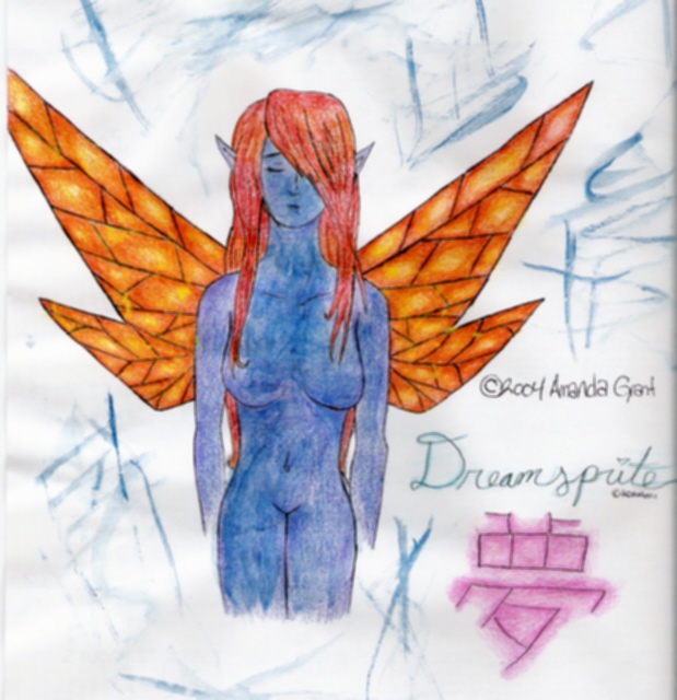
What can I say about this piece... Well I worked hard on it, and am satisfied with the result. Comments and/or constructive criticism are welcome. Please do not complain about the boobs. x_x I think the wings were hardest to color. Oi... Trust me, it looks much better in real life. *glares at scanner*<br />
Time: roughly 5 hours.<br />
Tools: sketched with pencil, inked, colored with really crappy colored pencils and watercolors.<br />
Music listened to: The Lord of the Rings: The Two Towers soundtrack.
Time: roughly 5 hours.<br />
Tools: sketched with pencil, inked, colored with really crappy colored pencils and watercolors.<br />
Music listened to: The Lord of the Rings: The Two Towers soundtrack.
General Info
General Info
Ratings
Category Anime/Manga » Yu-Gi-Oh! series » Cards
Date Submitted
Views 3743
Favorites... 5
Vote Score 0
Category Anime/Manga » Yu-Gi-Oh! series » Cards
Date Submitted
Views 3743
Favorites... 5
Vote Score 0
Comments
6
Media Unspecified
Time Taken
Reference
Media Unspecified
Time Taken
Reference
Comments
You are not authorized to comment here. Your must be registered and logged in to comment
KATTALNUVA on January 31, 2005, 4:42:54 AM
KATTALNUVA on
Angel_of_Purifing_Light on November 13, 2004, 8:35:59 AM
LordDante6783 on June 30, 2004, 10:10:57 AM
crystaldream on April 17, 2004, 3:18:38 PM
crystaldream on
TheDarkShiva on April 7, 2004, 1:46:15 AM
TheDarkShiva on
MandyPandaa on April 5, 2004, 11:13:14 PM
MandyPandaa on
