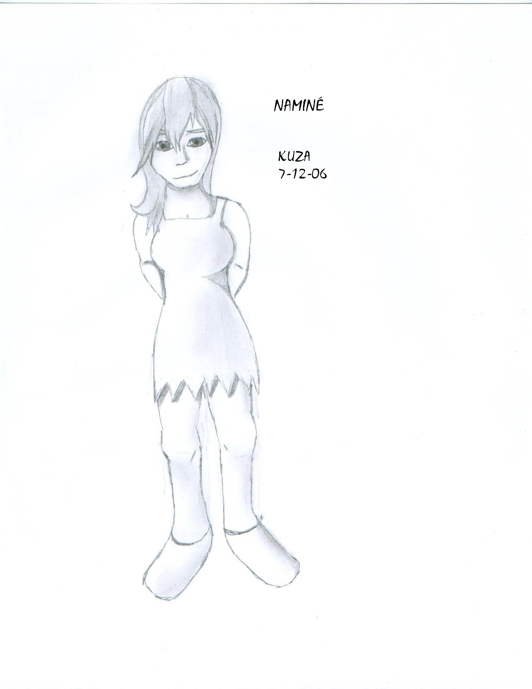
Naminé
Naminé
Naminé by kuza

Description
Description
General Info
General Info
Ratings
Category Games » - by Publisher » Square-Enix » Kingdom Hearts series » Chain of Memories, Kingdom Hearts II » Naminé
Date Submitted
Views 1355
Favorites... 0
Vote Score 0
Category Games » - by Publisher » Square-Enix » Kingdom Hearts series » Chain of Memories, Kingdom Hearts II » Naminé
Date Submitted
Views 1355
Favorites... 0
Vote Score 0
Comments
2
Media Graphite pencil
Time Taken
Reference
Media Graphite pencil
Time Taken
Reference
Comments
You are not authorized to comment here. Your must be registered and logged in to comment
kuza on July 22, 2006, 12:59:35 AM
kuza on
KupoKweh on July 21, 2006, 1:53:38 PM
KupoKweh on
VERY nice shading and anatomy. But now for my critique!
1. Teh bewbs. Nothing wrong with big breasts in art, but it should look realistic. Her cleavage wouldn't be showing when the neckline is that low unless her breasts were smooshed... But they aren't. XD. And one boob is bigger than the other. Also, there should be some shading under her er.. "goods". :P
2. The feet. The positioning of the feet is good, but you should define where the top of the foot is to define the shape and angle. You did well with this on her right foot (your left) but the other one could use some more definition, especially around the heel. Now probably wouldn't be a good time to mention it, but her shoes are off. X_X If it's because you're like me and are deathly afraid of foot anatomy and hate drawing them in sandals... No prob! XD But in the future you might want to take a stab at it. And also (sorry!) you should draw the sole of the shoes. Oh, and one more thing... Her ankles would be exposed, so it's a good idea to draw those. I know I'm going crazy with her feet, but they're a lot more than just the things you stand on... They can say a lot about both the subject AND the artist.
3. The face is VERY GOOD, but here are a few rules of thumb to remember: (professional artists, feel free to correct me!)
* The eyes are halfway down the head (you did that well). Yes, people have friggin' HUGE foreheads. O_o
* The bottom of the nose should be halfway between the eyes and the bottom of the chin
* The lips should be halfway between the bottom of the nose and the chin
* The jaw should be level with the mouth... Not the nose. :P
* The eyes and pupils should ALWAYS line up... That's my numero uno mistake. X_X
Sorry I critiqued the hell out of your pic, but believe me when I say it's a good pic, WAY more good than bad. (Especially since you didn't have a ref for the pose!) But you know, I wouldn't take 20 minutes to critique anyone besides someone who was my friend. :o) Keep it up, kuza! ^^

And I hardly EVER draw feet, and when I do, they look cartoony. So "mehh" on feet!
And I'll have to keep those Face Notes in mind. I knew about the 'eyes in the middle of the head,' but my lack of research and general amount of 'care,' I usually just made it up.
Thanks for those twenty minutes!