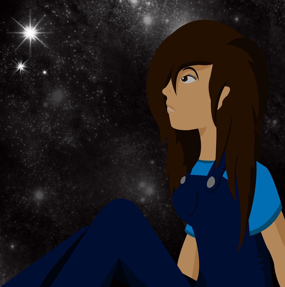
Dreams
Dreams
Dreams by mechadragon13

Description
Description
General Info
General Info
Comments
35
Media Digital drawing or painting
Time Taken FFFFFFFFFFFF... i forgot. a LOT.
Reference none.
Media Digital drawing or painting
Time Taken FFFFFFFFFFFF... i forgot. a LOT.
Reference none.
Comments
You are not authorized to comment here. Your must be registered and logged in to comment
luckylace222 on October 3, 2009, 4:08:30 AM
luckylace222 on
mechadragon13 on October 3, 2009, 4:10:55 AM
Zukoinferno on September 25, 2009, 1:54:51 PM
Zukoinferno on
mechadragon13 on September 26, 2009, 7:22:43 AM
Zukoinferno on September 27, 2009, 1:02:25 AM
Zukoinferno on
Zukoinferno on September 21, 2009, 12:38:02 PM
Zukoinferno on
mechadragon13 on September 21, 2009, 9:21:46 PM
Zukoinferno on September 22, 2009, 10:40:57 AM
Zukoinferno on
mechadragon13 on September 22, 2009, 10:52:51 AM
Zukoinferno on September 22, 2009, 11:12:08 AM
Zukoinferno on
mechadragon13 on September 22, 2009, 11:21:20 AM
Zukoinferno on September 22, 2009, 11:25:15 AM
Zukoinferno on
mechadragon13 on September 22, 2009, 11:27:43 AM
Zukoinferno on September 22, 2009, 11:29:51 AM
Zukoinferno on
mechadragon13 on September 24, 2009, 10:20:40 AM
Zukoinferno on September 24, 2009, 10:51:54 AM
Zukoinferno on
mechadragon13 on September 24, 2009, 12:29:13 PM
Zukoinferno on September 24, 2009, 12:53:32 PM
Zukoinferno on
mechadragon13 on September 24, 2009, 1:01:48 PM
Zukoinferno on September 24, 2009, 1:08:37 PM
Zukoinferno on
mechadragon13 on September 24, 2009, 1:15:03 PM
Zukoinferno on September 25, 2009, 1:54:12 PM
Zukoinferno on
Tinner1214 on September 22, 2009, 12:06:09 PM
Tinner1214 on
This style reminds me of a childhood cartoon, can't put my finger on it... But I like it a lot.
I've got it. The style is just a little like 'Kim Possible' with a tad of...
something else, a little cleaner in the lines...
Shading is epic. I love how you don't use too much cluttery lines (Ah is grammah failz 2day). Doesn't that overalls look a little like the ones we make in Home Ec to you?
The hair could use just a little work. It's all in a big piles up there, it looks a little thick and heavy on top of her head. *rubs chin thoughtfully* you know, maybe all people just look that way and never have I notice it before...
Love the eyes and eyebrow, slightly manga, though looks a little too unreal if you look at it too long... I don't quite like the lips for some reasons my subconscious doesn't tell my conscious. Maybe the shading is off a little.
*stares in slight awe* *stares thoughtfully at stars* *starts thinking he should get back to homework*
Agh, whatevuh. Good work Mishy, keep drawing. BTW I want to talk to you tomorrow morning, I'll be waiting in that hallway we always pass each other in.
mechadragon13 on September 23, 2009, 8:36:15 AM
Tinner1214 on September 22, 2009, 12:09:28 PM
Tinner1214 on
Tinner1214 on September 22, 2009, 12:09:52 PM
Tinner1214 on
Falconlobo on September 22, 2009, 3:46:51 AM
Falconlobo on
mechadragon13 on September 22, 2009, 6:25:38 AM
Falconlobo on September 22, 2009, 10:12:00 AM
Falconlobo on
DistantDragon on September 21, 2009, 9:03:32 PM
i hope this is of help to u ^_^ excellent piccy
mechadragon13 on September 21, 2009, 9:22:41 PM
DistantDragon on September 22, 2009, 6:12:27 AM
firehead on September 21, 2009, 11:51:57 AM
firehead on
firehead on September 21, 2009, 11:52:37 AM
firehead on

I like how you gave her a lighter lip on the bottom!