Aqua - SAI
Aqua - SAI
Aqua - SAI by mechadragon13

Description
Description
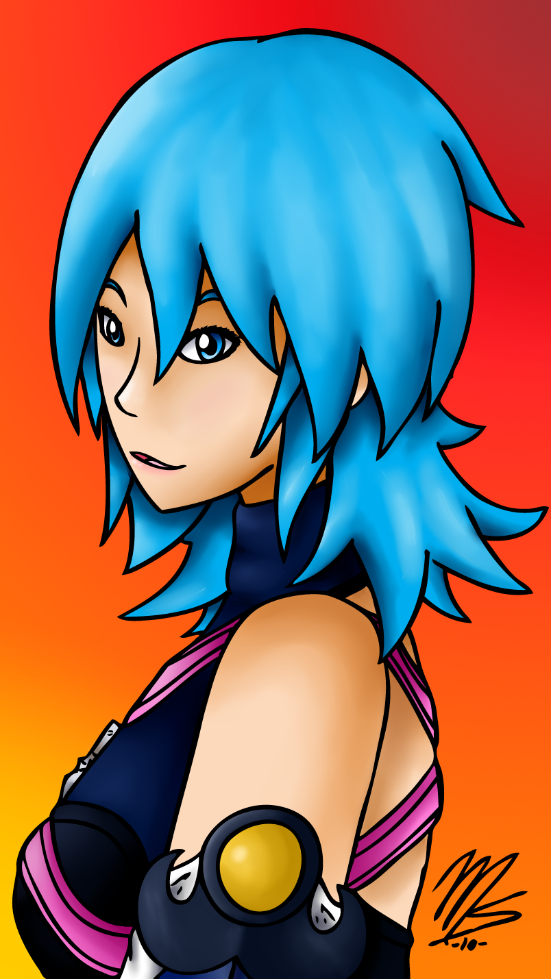
FWEEEEEEEE AQUA! one of my favorite female characters EVORZ. :3
so yeah, she got the SAI treatment along with Terra. her hair was a pain in the butt, and i STILL think it looks funny .______.;
i'm still loving SAI. as soon as my trial period runs out, i'm buying it :3
COMMENT AND CRITIQUE PLEASE~!
Aqua (C) Squeeeeeeeeeenix
Artwork (C) me~
so yeah, she got the SAI treatment along with Terra. her hair was a pain in the butt, and i STILL think it looks funny .______.;
i'm still loving SAI. as soon as my trial period runs out, i'm buying it :3
COMMENT AND CRITIQUE PLEASE~!
Aqua (C) Squeeeeeeeeeenix
Artwork (C) me~
General Info
General Info
Ratings
Category Games » - by Publisher » Square-Enix » Kingdom Hearts series » Characters (KH1)
Date Submitted
Views 1577
Favorites... 5
Vote Score 3
Category Games » - by Publisher » Square-Enix » Kingdom Hearts series » Characters (KH1)
Date Submitted
Views 1577
Favorites... 5
Vote Score 3
Comments
10
Media Digital drawing or painting
Time Taken a few hours on and off.
Reference none
Media Digital drawing or painting
Time Taken a few hours on and off.
Reference none
Comments
You are not authorized to comment here. Your must be registered and logged in to comment
Iamphotoshop on July 16, 2010, 1:57:38 AM
Iamphotoshop on
Falconlobo on June 11, 2010, 2:26:06 PM
Falconlobo on
killerrabbit05 on June 9, 2010, 7:37:24 AM
mechadragon13 on June 9, 2010, 8:14:00 AM
luckylace222 on June 8, 2010, 10:13:16 AM
luckylace222 on
mechadragon13 on June 8, 2010, 10:18:53 AM
TheGameArtCritic on June 8, 2010, 7:59:33 AM
The colors are very nice, btw. It's very fun, kinda like eye-candy. I can also see a bit of pinkish-red that you blended into the cheeks. Nice touch.
The technical issues I'm having here -
1. pointy chin
2. flat sticker-eyes (you need to shade them in a way that they look 3D)
3. the mouth is... still... too low. The human mouth is, like, DIRECTLY under the nose, Mish.
Mouth-to-nose: http://wwwdelivery.superstock.com/WI/223/1647/PreviewComp/SuperStock_1647R-79328.jpg
Now, that isn't exactly the BEST image, but you see what I mean, there. ^^;
mechadragon13 on June 8, 2010, 8:10:27 AM
1- this was just a color test, using this OLD sketch http://www.fanart-central.net/pic-781439.html
2- i... thought i did O_O there IS shading there, but ok i'll try fixing it later.
3- see #1
I know what you mean about the mouth, though.
it's funny, if you turn off the linart, it looks slightly OKAY as a lineless piece. like, the edges of the colors still need to be CONNECTED, but it actually looks... good. i need to try a digipaint on SAI now >.>
