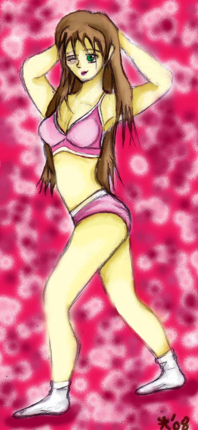
Sexy Chick (time constriction practice)
Sexy Chick (time constriction practice)
Sexy Chick (time constriction practice) by mendoza0089

Description
Description
i'm trying to practice several things. for one, proportion. i've been getting a lot of tips and this was a chance to see if i'm getting the idea. two, i'm trying to see how fast i can do a new picture with higher level detail. this time it took about an hour or so to draw the picture just right, and maybe two hours or so coloring it. that's pretty fast for me considering that i'm new to photoshop. also, as far as humans go, i haven't drawn much in the way of stuff that's sensitive. most of my stuff have had at least a hint of violence. hope you like it!
p.s.....it was an excuse to draw an anime chick in underwear ;D!!! LOL
p.s.....it was an excuse to draw an anime chick in underwear ;D!!! LOL
General Info
General Info
Ratings
Category Anime/Manga » - Original art » Characters (Female)
Date Submitted
Views 1135
Favorites... 2
Vote Score 3
Category Anime/Manga » - Original art » Characters (Female)
Date Submitted
Views 1135
Favorites... 2
Vote Score 3
Comments
4
Media Digital drawing or painting
Time Taken 3 hours give or take
Reference bra, and hair styles
Media Digital drawing or painting
Time Taken 3 hours give or take
Reference bra, and hair styles
Comments
You are not authorized to comment here. Your must be registered and logged in to comment
Falconlobo on July 6, 2008, 10:54:20 AM
Falconlobo on
mangacheese1818 on June 27, 2008, 1:38:55 PM
Neck is a bit long, and the face starts a bit low down. That could be attributed to the manga style, but it's best to avoid those sorts of proportions when possible.
The biggest problem I noticed is that the arms are too long. When down, the elbow should only reach down to the bottom of the ribcage, the forearm should end roughly at the hips, and the fingers should just pass the crotch. They're also closer to a more normal thickness (yay), whereas her waist is much more manga-like. Both styles are fine in their own right, but when mixed, it makes her upper arms look almost flabby.
The absence of any lines of her torso is a little awkward in this position. No need to go crazy, but one deftly-laced line makes it much easier to tell that she's twisting.
I'll admit, I like how you handled her thighs. They're not too skinny, and you've avoided the common mistake of making them too short. Her left calf muscle is a bit weird, but the right one is fine. Just watch for consistency.
As for the feet; the front half is too flat. Toes have volume.This might help :D
Er, sorry, I got kind of nitpicky. I hope that wasn't too much :/
melina678 on June 27, 2008, 1:22:32 PM
melina678 on
Ok, from what I see, from the torso to the waist is just fine. It's a nice length without being stout or lanky. The length of the arms are good, but I noticed the biceps on each arm a little thicker than the other. Next time, make them just a tad more slender. On her right arm (your left), her shoulder seems a little lower when it should be up a little higher with the position of the arm. Everything else on the top is fine. Now to the lower area. What I noticed about the leg region is that her legs look a little too short. My suggestion would be to either shorten the thighs or make the calves a little longer to match the size of the body evenly.
But, all of those are just suggestions. You don't have to listen to them XD Other than those things, awesome job =)
