Warhammer 40,000: The Luna Wolves
Warhammer 40,000: The Luna Wolves
Warhammer 40,000: The Luna Wolves by mikkow

Description
Description
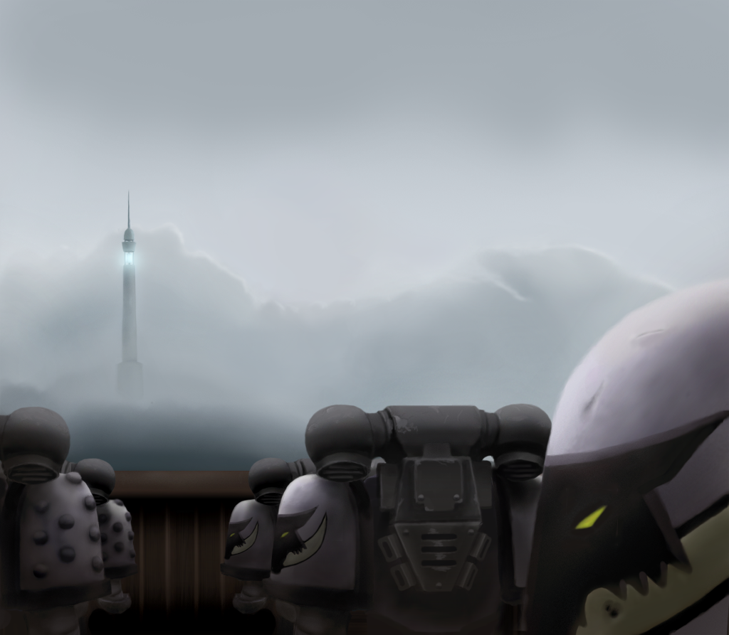
Warhammer 40,000: Luna Wolves, standing in an assembly in front of an empty podium at an old world during the great crusade, year 29,013. The chapter was lead by Primarch Horus, the figure most noteworthy for turning on the emperor and leading a revolt. The chapter first was renamed to Sons of Horus. Then after Horus was slain, the chapter repainted themselves black and took the name "Black Legion".
No references used. Some research material on the Luna Wolves logo and paint scheme was kindly provided by ~ Kedeawyth. Painted in Photoshop 7 and CS. How much time I don't know, as most of the time consuming parts were discarded. Perhaps 6-7 hours on what is actually showing.
This was originally a scrap from over a year ago. Nothing much changed. I became sick of it, simply. So there seems to be little purpose to the scene. Originally, Horus or Abaddon (The chapter captain) would have been on the podium giving some speech or similar, but alas, not this time.
The best bit was the last - adding wheathering and other little details. You should see it very clearly in full screen mode if nothing else. I agreed with the previous critique, the armors looked too clean and fresh. No more.
Please do visit my real art homepage, with several more artworks!
http://mikkow.deviantart.com
General Info
General Info
Ratings
Category Games » - All Titles » Warhammer series
Date Submitted
Views 3184
Favorites... 4
Vote Score 1
Category Games » - All Titles » Warhammer series
Date Submitted
Views 3184
Favorites... 4
Vote Score 1
Comments
5
Media Unspecified
Time Taken
Reference
Media Unspecified
Time Taken
Reference
Comments
You are not authorized to comment here. Your must be registered and logged in to comment
qazqaz1 on August 17, 2008, 10:56:23 AM
qazqaz1 on
PYROFREAK on March 5, 2006, 9:16:19 AM
PYROFREAK on
Edge14 on January 2, 2006, 12:55:52 PM
Edge14 on
renegade_marker_5463 on November 15, 2005, 7:48:46 AM
OrangeArt on June 18, 2005, 6:38:01 PM
OrangeArt on
