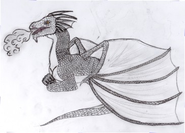
Dragon at rest
Dragon at rest
Dragon at rest by phoenixgigs

Description
Description
General Info
General Info
Comments
15
Media Unspecified
Time Taken
Reference
Media Unspecified
Time Taken
Reference
Comments
You are not authorized to comment here. Your must be registered and logged in to comment
dragon45 on September 24, 2006, 6:55:50 AM
dragon45 on
Sapphire_Angels_Devil on January 25, 2006, 1:46:09 AM
mikita_inugirl on December 30, 2005, 4:37:20 AM
Ricky_rules on December 2, 2005, 9:56:24 PM
Ricky_rules on
phoenixgigs on November 19, 2005, 4:09:58 AM
phoenixgigs on
Gerudowolf on November 18, 2005, 8:54:03 PM
Gerudowolf on
phoenixgigs on November 4, 2005, 1:39:11 AM
phoenixgigs on
phoenixgigs on October 30, 2005, 9:24:04 PM
phoenixgigs on
sis on October 28, 2005, 10:15:49 PM
sis on
phoenixgigs on September 28, 2005, 2:04:49 AM
phoenixgigs on
silverstar on September 25, 2005, 4:06:42 AM
silverstar on
phoenixgigs on September 10, 2005, 1:51:14 AM
phoenixgigs on
Gerudowolf on September 9, 2005, 8:36:43 PM
Gerudowolf on
phoenixgigs on September 9, 2005, 12:48:35 AM
phoenixgigs on
moomeister3 on September 7, 2005, 5:35:46 AM
moomeister3 on
Well, overall it's good. The smoke is a little more cartooney then the rest of the dragon. I do like the detail of the scales though. Another thing I noticed was the wings. What would have been cool is if the wings had been translucent. Just the flappy parts though so that you could faintly see the rest of his body. Because right now, not really knowing the genetic makeup of dragons, I can't imagine what his legs would be doing, the length of his body or anything. Also, if it was translucent, you could have added more spikes on the back part of the bady.
Personally, this would look cool inked and colored. I mean, unless you just wanted the eyes and mouth colored...then it would look cool inked and shaded everywhere else! Or whatever. Nice pic!
