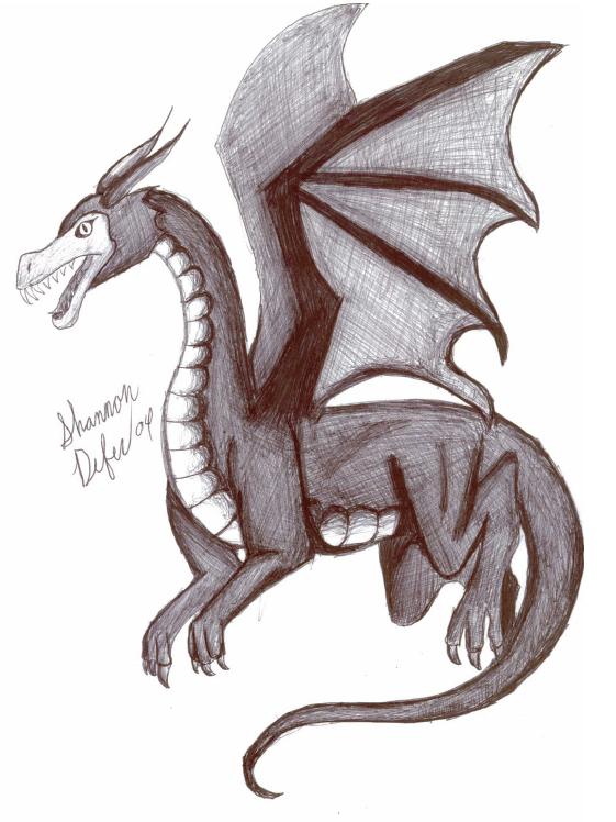
Ink flying dragon
Ink flying dragon
Ink flying dragon by shady

Description
Description
General Info
General Info
Comments
7
Media Unspecified
Time Taken
Reference
Media Unspecified
Time Taken
Reference
Comments
You are not authorized to comment here. Your must be registered and logged in to comment
mikita_inugirl on December 23, 2005, 10:12:09 AM
Stratadrake on July 30, 2004, 7:04:22 PM
Stratadrake on
<br />
Those aside, when I compare this to my usual list of criteria for dragons:<br />
- The wing bones aren't dangerously thin<br />
- The neck and tail are neither too long nor too thin<br />
- The legs are evenly proportioned<br />
...I find hardly anything I can complain about. That leaves the technique. The crosshatching is a pretty nice job, although in some areas like the wings it could look better if you use a less rigid cross-hatching, i.e. align most of the lines to paralell the contours of wing edges and partitions. Same for the body, put some more curves into the shading, and it'd be perfect. So the big question of the night is should I fave this or not?<br />
<br />
Or maybe the big question for the night is, considering it's been months since you first made and uploaded this drawing, if you were to go back and draw a dragon, how much better would it look?
Blader_Mairiel on June 11, 2004, 11:58:55 PM
Koolkat6968 on March 2, 2004, 6:53:13 AM
Koolkat6968 on
BlackNinja on February 10, 2004, 10:09:03 AM
BlackNinja on
